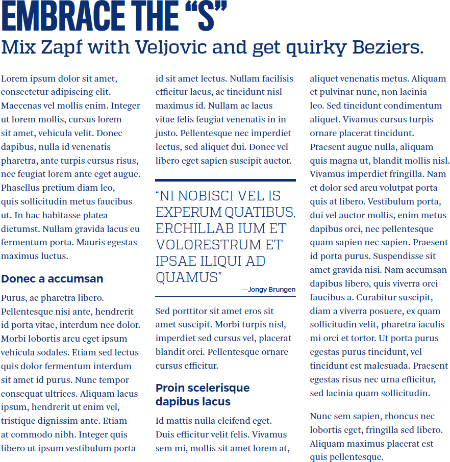
Typography
Overview
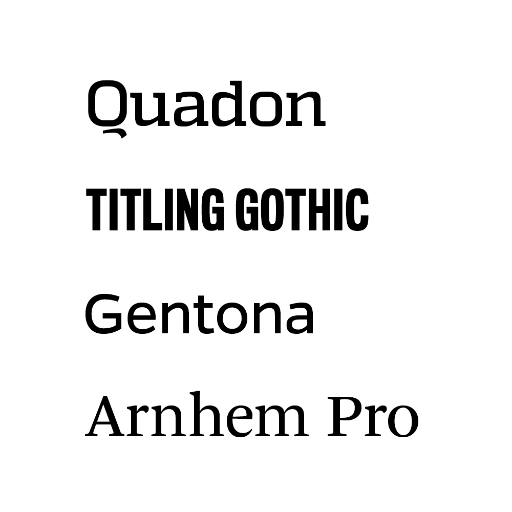
We offer four approved typefaces—Quadon, Titling Gothic, Gentona, and Arnhem Pro—that allow for creative expression of our brand personality in ways that are appropriate for our diverse audiences and goals. It is important to note that we are selective in which specific weights and styles we use from each typeface. Contact your divisional communications office for access to university fonts. Fonts must not be shared without going to your divisional communications office as we have a limited number of licenses to cover only designated communications and marketing roles.
There will be instances where the JHU brand fonts cannot be utilized because of technical limitations or restrictions. An example of this limitation is an HTML email in which attempts to include the brand fonts will likely fail. In these situations, Tahoma and Georgia should be used.
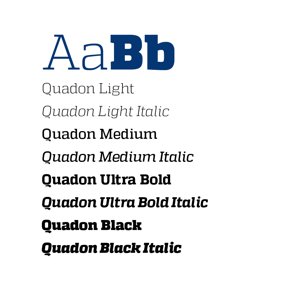
Quadon
Quadon is the signature typeface for the JHU brand as it expresses the university’s personality in a distinctive manner. It is collegiate, yet current.
Quadon is strongest in display and impact applications, especially when the university’s personality needs to be expressed. It may also be used in headlines, subheads, and limited body copy applications. It is available in a variety of approved weights and formats.
Fallback: Tahoma

Gentona
Gentona, a sans serif font with a close typographic relationship to Quadon, is a body copy font that may also be used in headlines and subheads when Quadon is too casual for the communication or audience.
Gentona is best used in situations where simplicity and legibility are paramount. It works best in body copy and headline applications, and reproduces well at small sizes.
Fallback: Tahoma
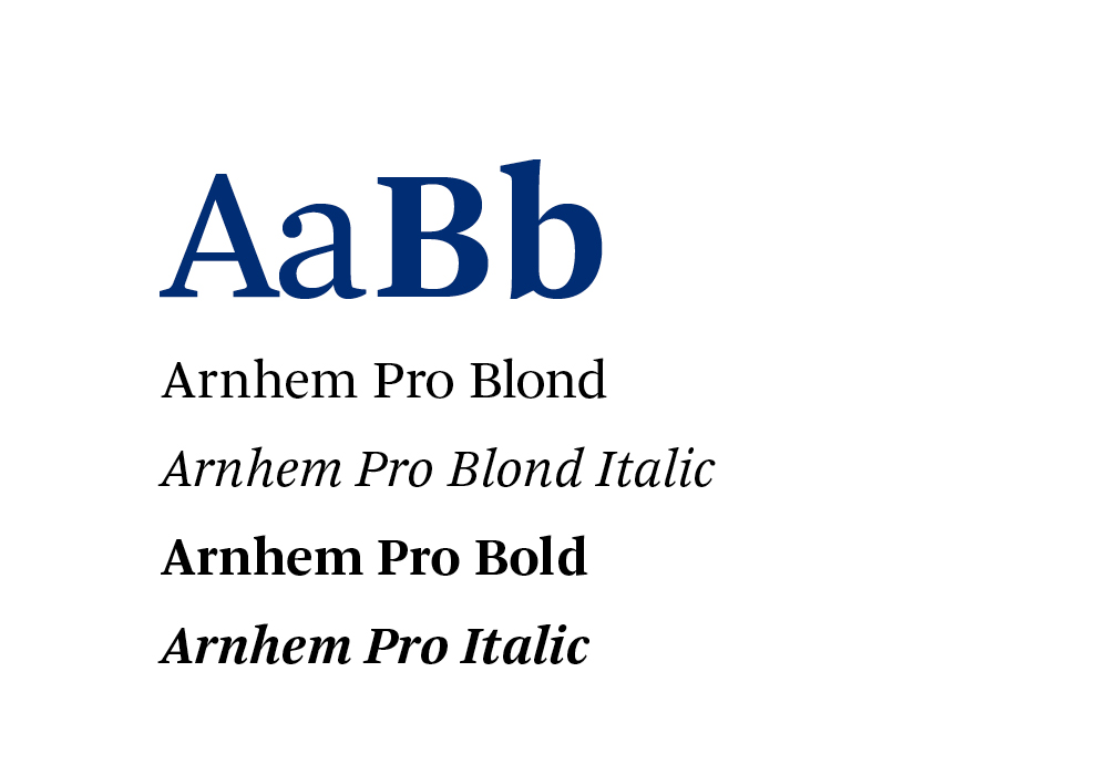
Arnhem Pro
Arnhem is a serif font best suited for body copy but can be used for headlines, subheads, and typographic accents that require a traditional look. Use in all-caps is not recommended.
Fallback: Georgia
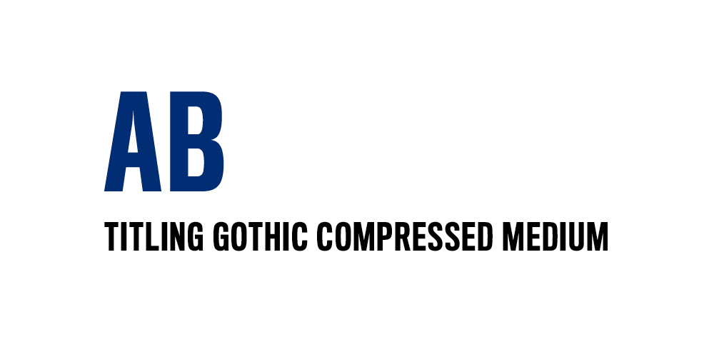
Titling Gothic
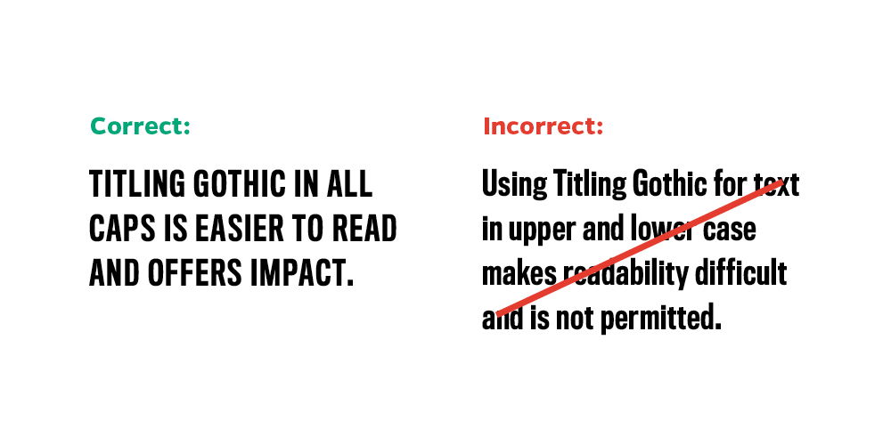
Titling Gothic is our impact font. It is best suited for headlines and should be used only in all caps and in short lines and phrases (between 10 and 15 words). Very limited use is recommended for maximum impact. As Titling Gothic and Quadon both act as impact typefaces, Quadon must always be used in a secondary role when Titling Gothic takes the lead to maintain the typographic representation of the brand.
Fallback: Tahoma

Font pairings
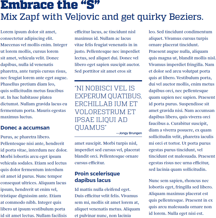
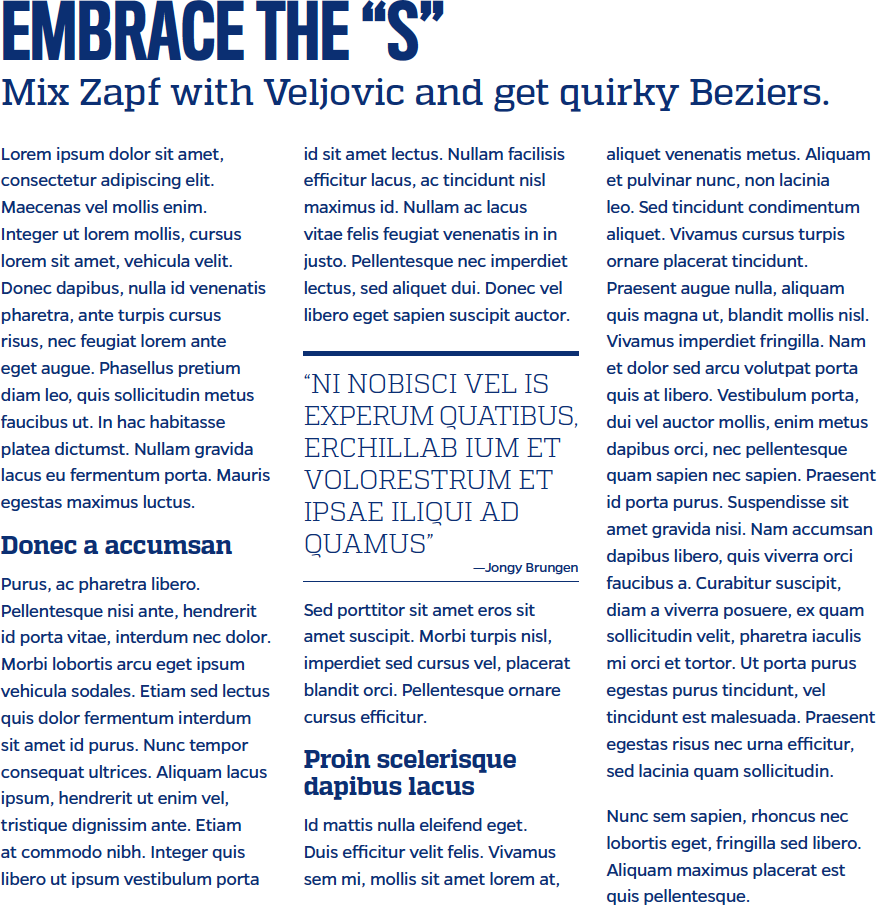
Establishing font pairings will help create greater visual consistency across all university communications. Viewers will begin to connect each typeface with a specific meaning. Quadon is very likely to be delivering brand messaging, while Gentona or Arnhem could be delivering more utility-focused information.
Combining all four fonts in one document can come across as busy or messy if used incorrectly, so we recommend limiting font usage to two or three at once. Our default recommended font pairing is Quadon for headlines and Gentona for body copy.
Websites, emails, and online applications
For websites, HTML emails, and online applications Johns Hopkins University uses an alternate collection of fonts provided by Adobe Fonts. This collection has been chosen to resemble our original brand fonts as closely as possible in character and utility to maintain a consistent look and feel of Johns Hopkins University across all mediums. The approved fonts for use on the web are as follows:
Factoria: Quadon equivalent
Approved weights: Light, Light Italic, Medium, Medium Italic, Bold, Bold Italic, Ultra, Ultra Italic
fonts.adobe.com/fonts/factoria
Proxima Nova: Gentona equivalent
Approved weights: Light, Light Italic, Medium, Medium Italic, Bold, Bold Italic, Black, Black Italic
fonts.adobe.com/fonts/proxima-nova
Freight Text Pro: Arnhem Pro equivalent
Approved weights: Medium, Medium Italic, Black, Black Italic
fonts.adobe.com/fonts/freight-text
ATF Alternate Gothic Extra Condensed: Titling Gothic Compressed equivalent
Approved weights: Heavy (all caps only)
fonts.adobe.com/fonts/atf-alternate-gothic-extra-condensed
Webfont Code
Users with an active Adobe Creative Cloud account may generate their own font packages directly from fonts.adobe.com using the approved list of fonts and weights above. For simplicity and ease of use we have also provided pre-packaged collections for use to any Johns Hopkins University entity.
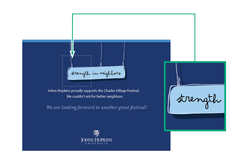
Type as Art
In instances where a typeface becomes part of an illustration, a font other than Quadon, Titling Gothic, Gentona, or Arnhem Pro may be appropriate.