Environmental Branding
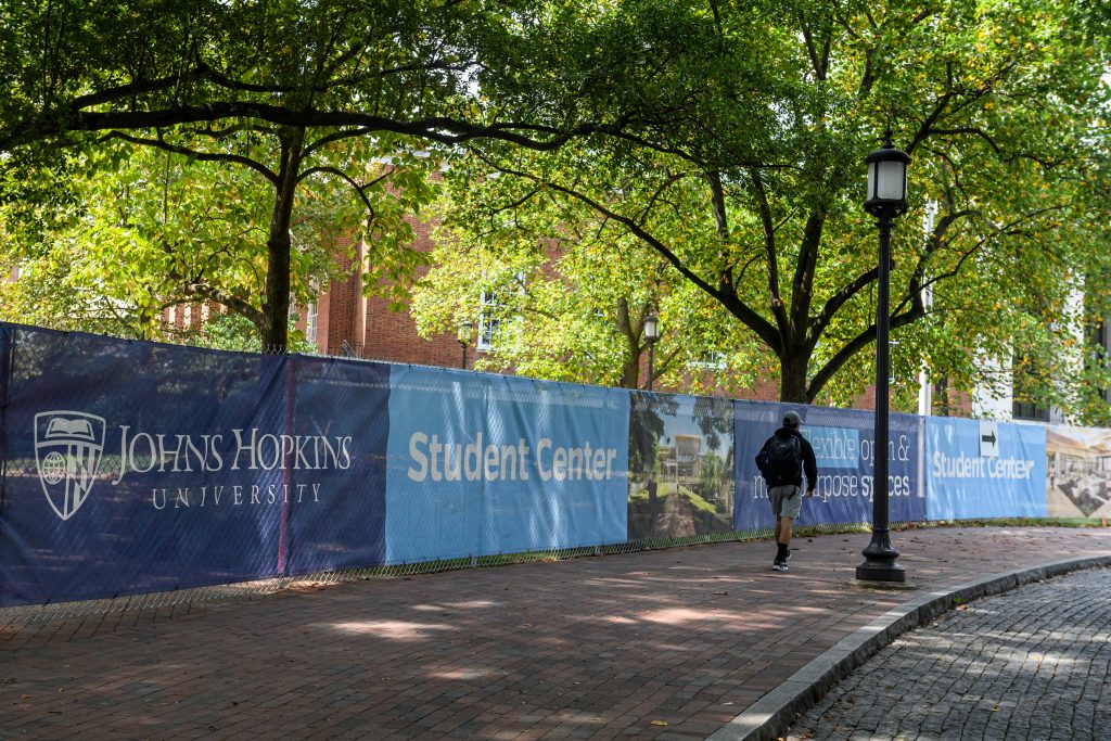
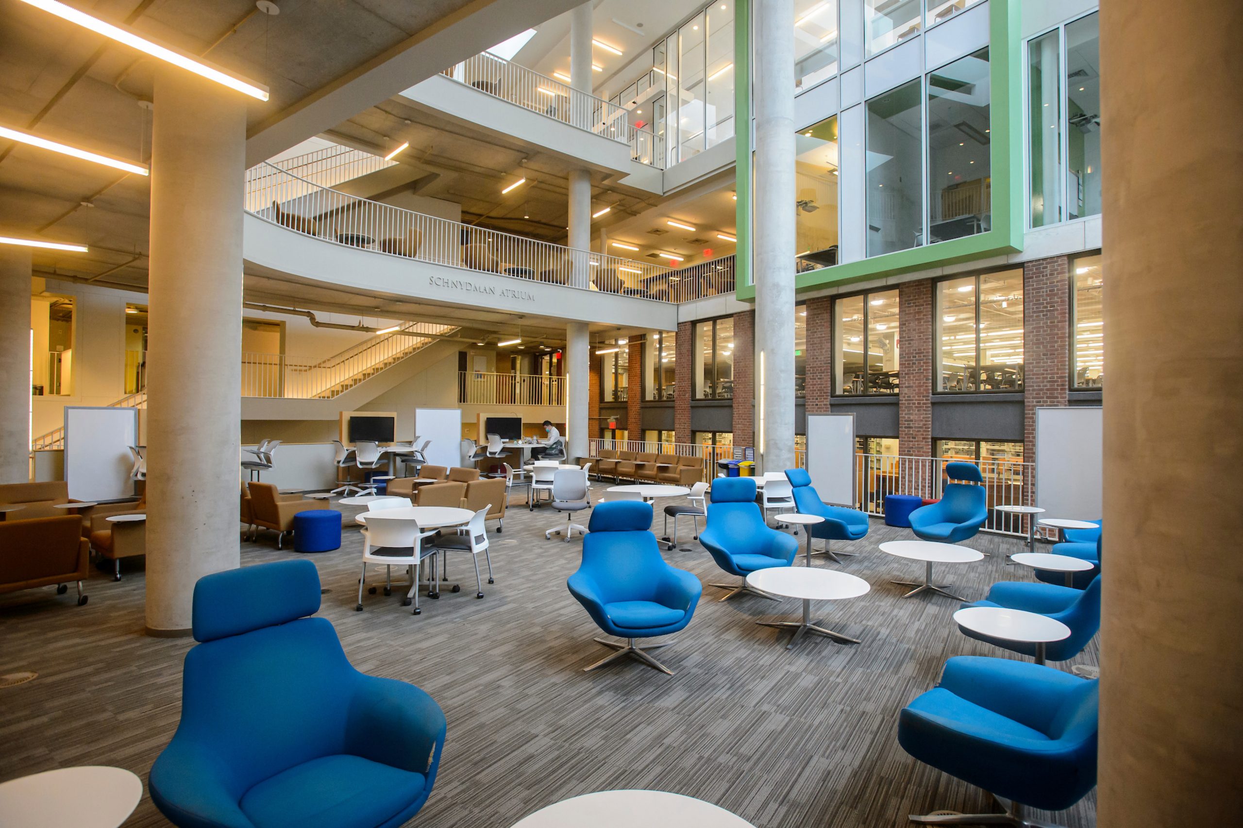
Environmental branding is the expression of the Johns Hopkins University brand in our physical spaces.
By applying the brand in our spaces, both indoors and out, we represent ourselves as One University for everyone who visits, works, and studies at Johns Hopkins. Whether achieved through paint colors, fabrics, furniture, or signage, our environmental branding should create inspired spaces that reflect our commitment to bringing the benefits of discovery to the world.
Environmental branding falls into three categories, each requiring different levels of collaboration with key stakeholders:
- Temporary Signage (DIY resources available)
- Wayfinding (led by Johns Hopkins Facilities and Real Estate)
- Placemaking (led or guided by University Communications, sponsored by departments)
Guiding Design Principles
As you begin on an environmental branding project, consider these guiding principles:
Lean in to Brand Colors
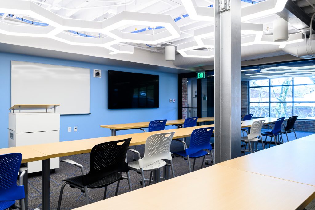
Leverage our primary colors, Heritage Blue and Spirit Blue, and neutrals to anchor your space. When given the option to choose between red chairs or blue chairs, pick the blue chairs! It doesn’t need to be an exact match to our color palette, just as close as possible.
Incorporate Bold Accents
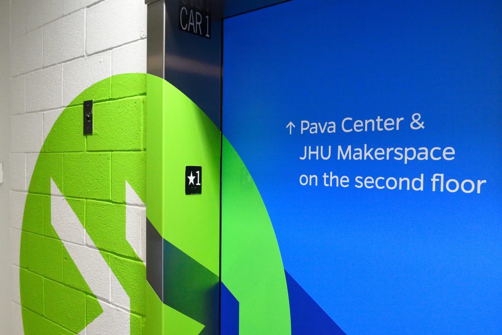
Use secondary colors, fun decor, or unique lighting to bring personality to your space. Bold accents should be used sparingly and strategically to make an impact.

Call on Graphic Elements
Where an accent wall or specialty display is needed, explore our design assets, such as shields, patterns, typography, and photography, to bring spirit to your space.

Encourage Interaction
Create memorable moments in your space with interactive branding. These interactions, big and small, help to build community and brand affinity.
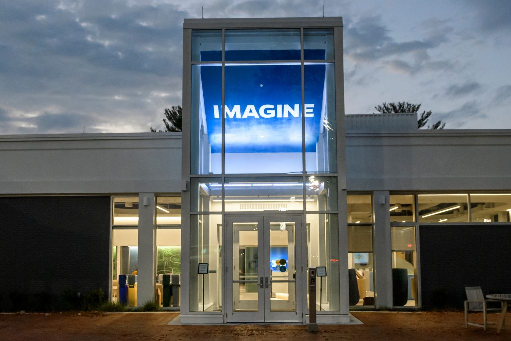
Highlight Key Messages
Feature a key message of Johns Hopkins or your unit with wall vinyls, window clings, or digital signage.
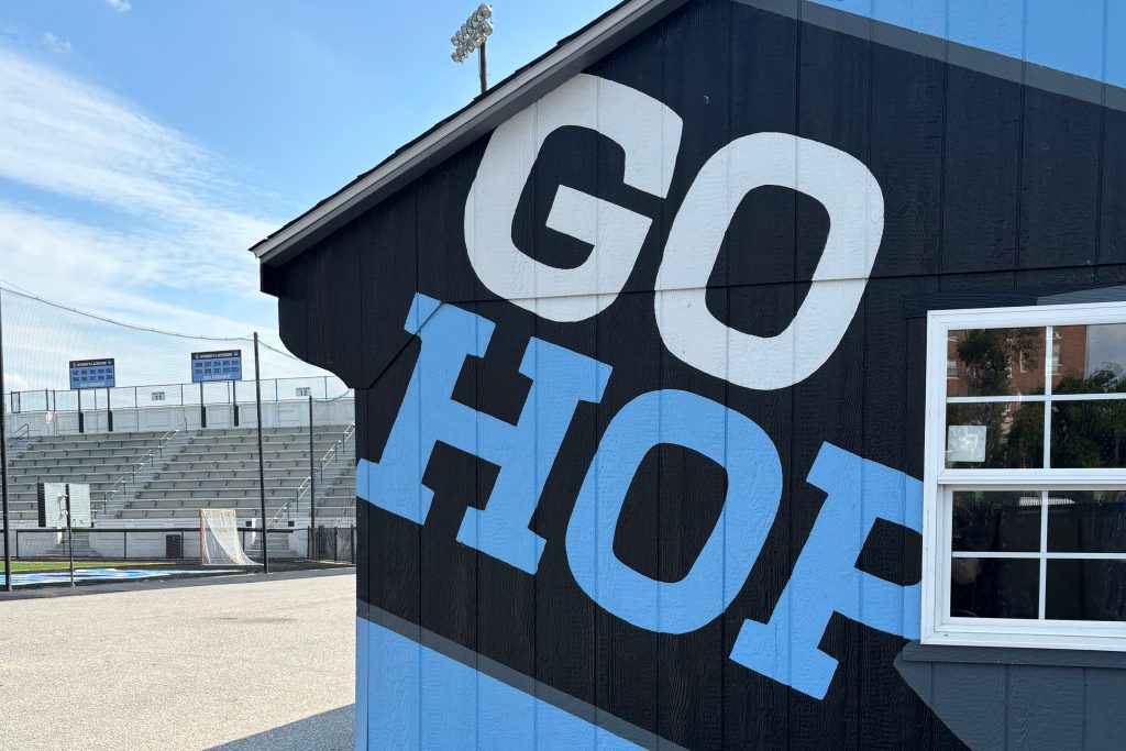
Make Selections That Will Last
Consider longevity in both your design and material selections. Environmental projects can be costly and time consuming to complete and maintain so removal and updates must be considered at the time of installation to make sure graphics do not become dated or unkempt.
Temporary Signs & Graphics
Temporary signage can be strategically implemented by any unit to promote events, initiatives, campaigns, and more. Defined as collapsible or removable installations (ex. pop-up banners and lawn signs), temporary signage offers a flexible solution to supplement wayfinding and placemaking. All temporary signage must align with our Johns Hopkins University visual identity and must be removed by the responsible unit after a maximum of four weeks.
Editable temporary sign resources can be found in our advanced template collection.
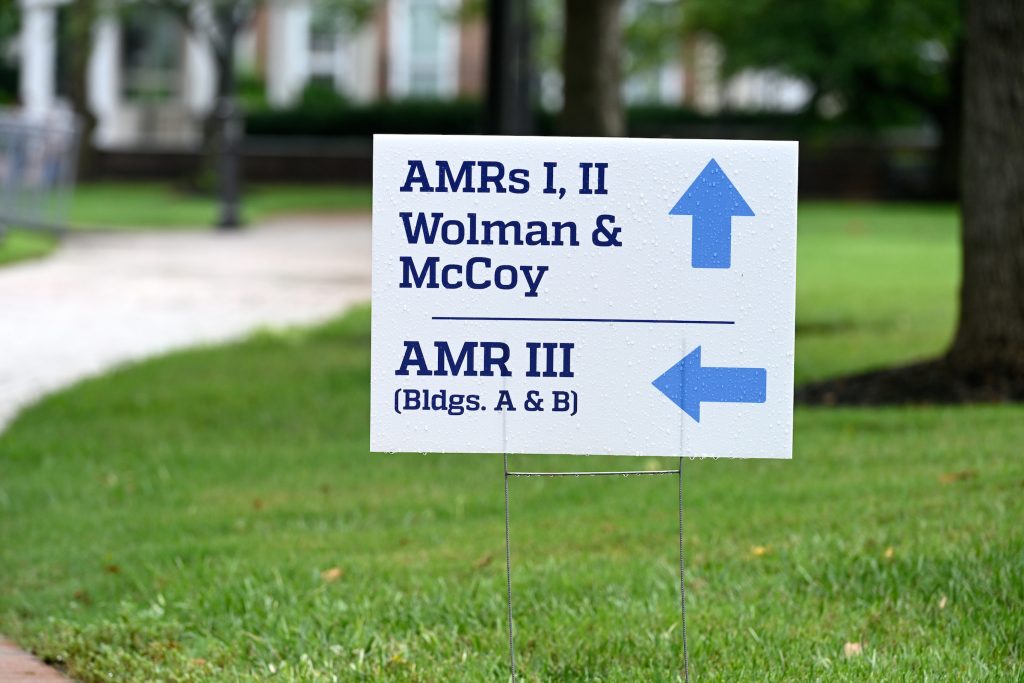
Lawn Signs
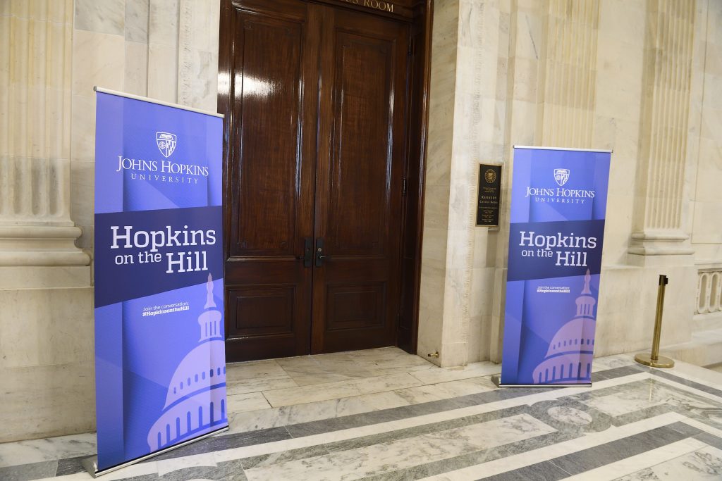
Banners & Flags
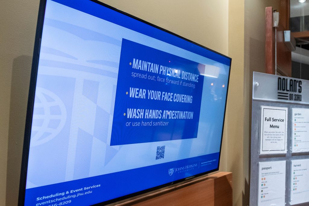
Digital Signage
Wayfinding
Wayfinding signage includes informational directives, building identification, and more utilitarian needs. It follows standardized templates defined by the Johns Hopkins Facilities and Real Estate team (JHFRE), in partnership with University Communications. If you identify a wayfinding signage need in your area, please contact JHFRE. Where wayfinding signage currently varies across Johns Hopkins, standards are being defined to guide new and replacement signage. Custom wayfinding signage, beyond temporary supplemental needs, is not permitted unless implemented by JHFRE.
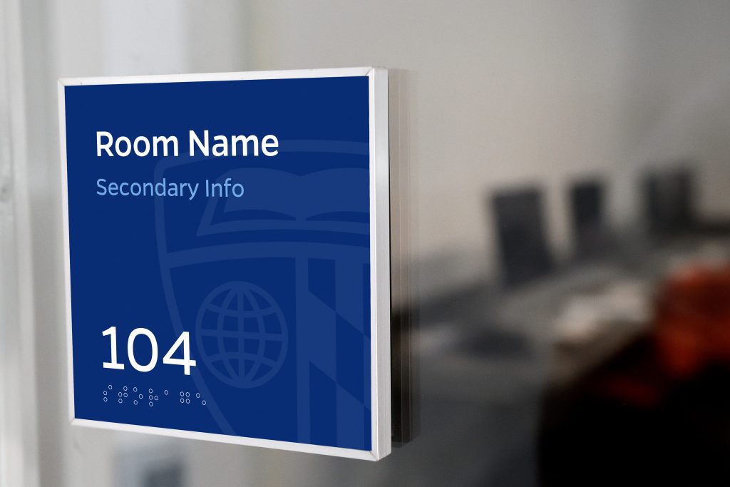
Interior Suite Sign
Our standard 5×5 inch ADA compliant room sign includes a paper insert to allow the JHFRE team to update content.

Exterior Monument Sign
Buildings are identified with a standard monument sign. These signs are managed by the JHFRE team.
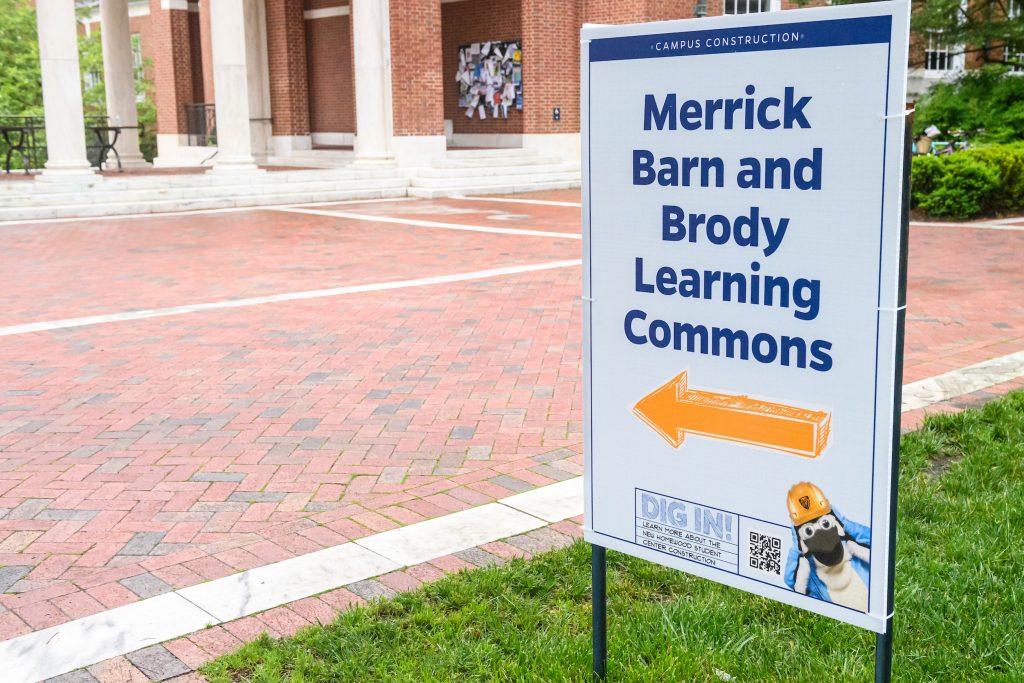
Construction Wayfinding
Construction wayfinding signage is managed by JHFRE using standard templates designed by University Communications.
Placemaking
Placemaking graphics are permanent or semi-permanent installations that show our brand personality and bring school spirit into a space. These graphics can be banners, murals, window clings, elevator wraps, or more complex two-dimensional designs and specialty items. For consultative guidance and design approval on placemaking within your unit’s space, please contact [email protected].
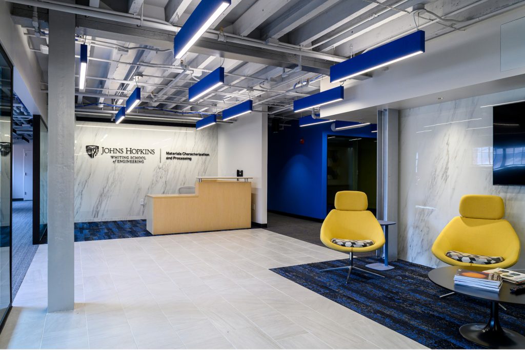
Reception Areas
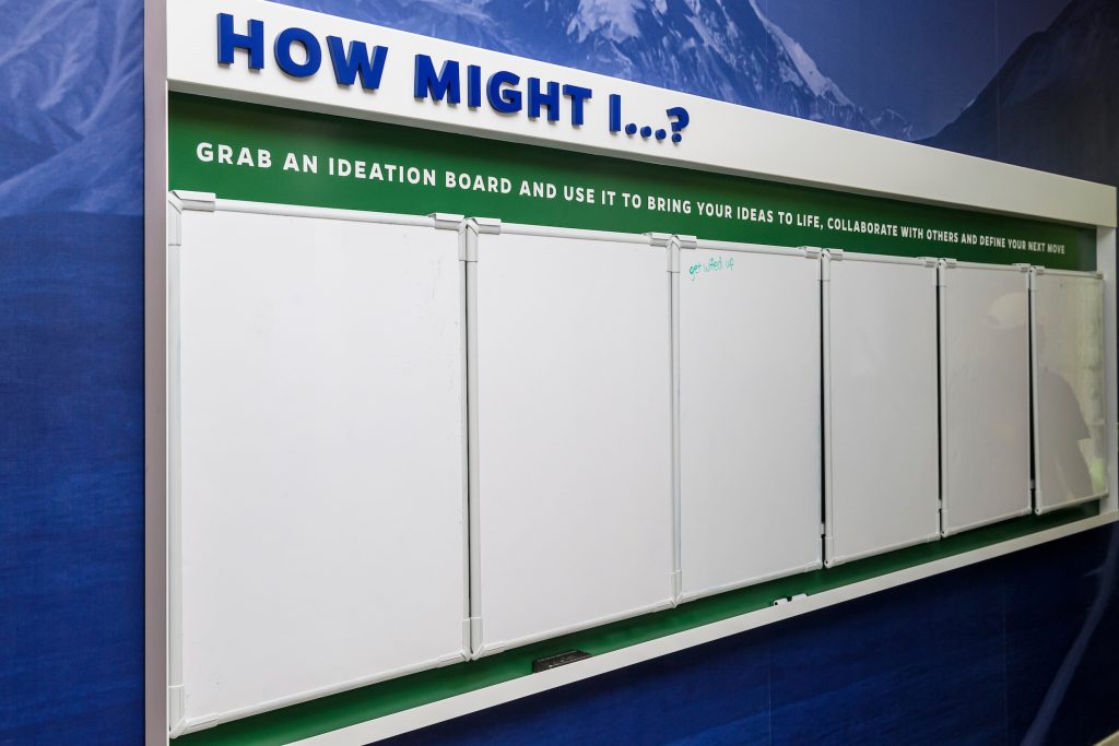
Accent Walls & Murals
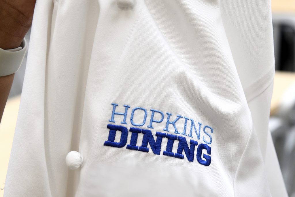
Uniforms
Now entering the Blue Zone
Blue Zones are external facing areas and activations that are high-visibility and audience-agnostic. Unlike the interior of a specific suite or lab, placemaking in a Blue Zone must represent the totality of our brand. As such, any projects in Blue Zone spaces must be done in collaboration with University Communications.
Sponsored Placemaking Projects in the Blue Zone
If your department is interested in collaborating on and sponsoring a Blue Zone activation, such as campus light pole banners, please complete our request form 3-6 months in advance of the desired installation.
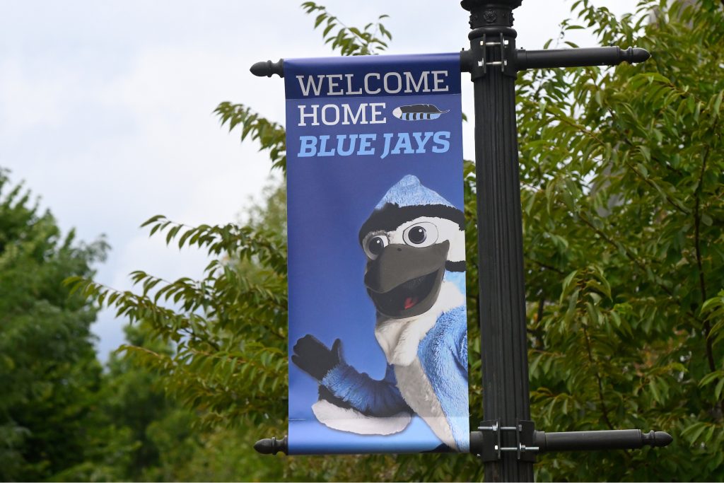
Light Pole Banners
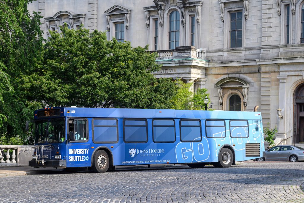
Transportation Services
