Typography
Johns Hopkins University’s four brand typefaces reflect our personality, tone, diverse audiences, and goals.
It is important to note that we are selective in the specific weights and styles we use from each typeface. The sections below show the approved typefaces and weights within the Hopkins brand.
a note on adobe garamond
Adobe Garamond is strictly reserved for use in the Johns Hopkins University logo system. You may not retype the logo or use the typeface for any marketing materials.
Primary Typefaces
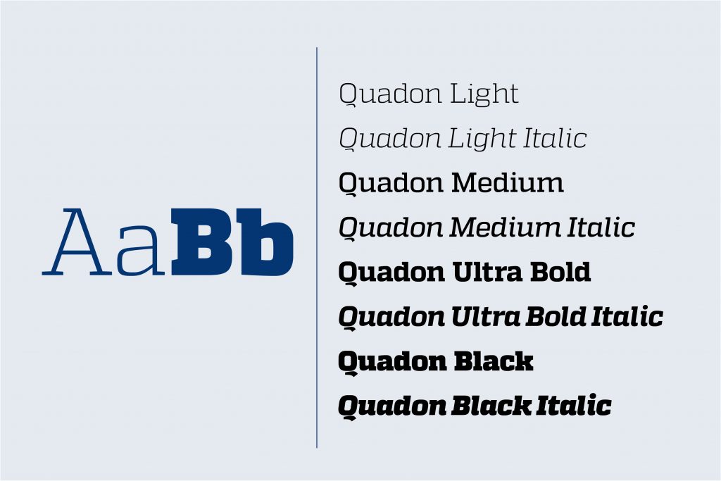
Quadon
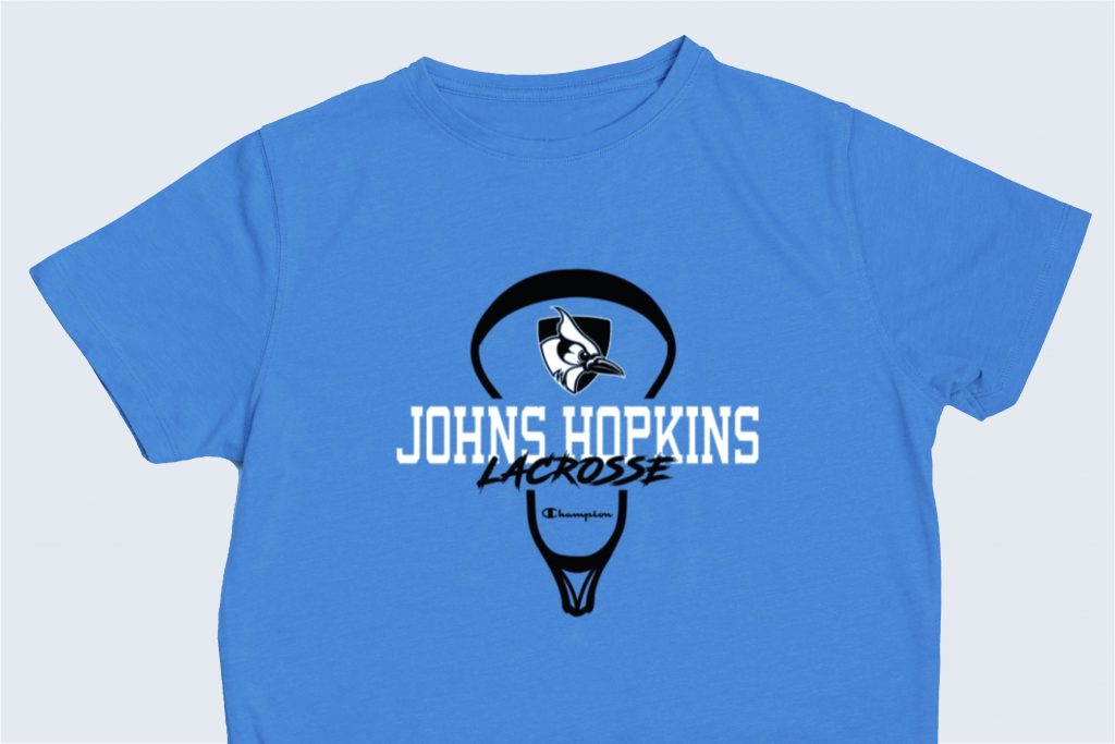
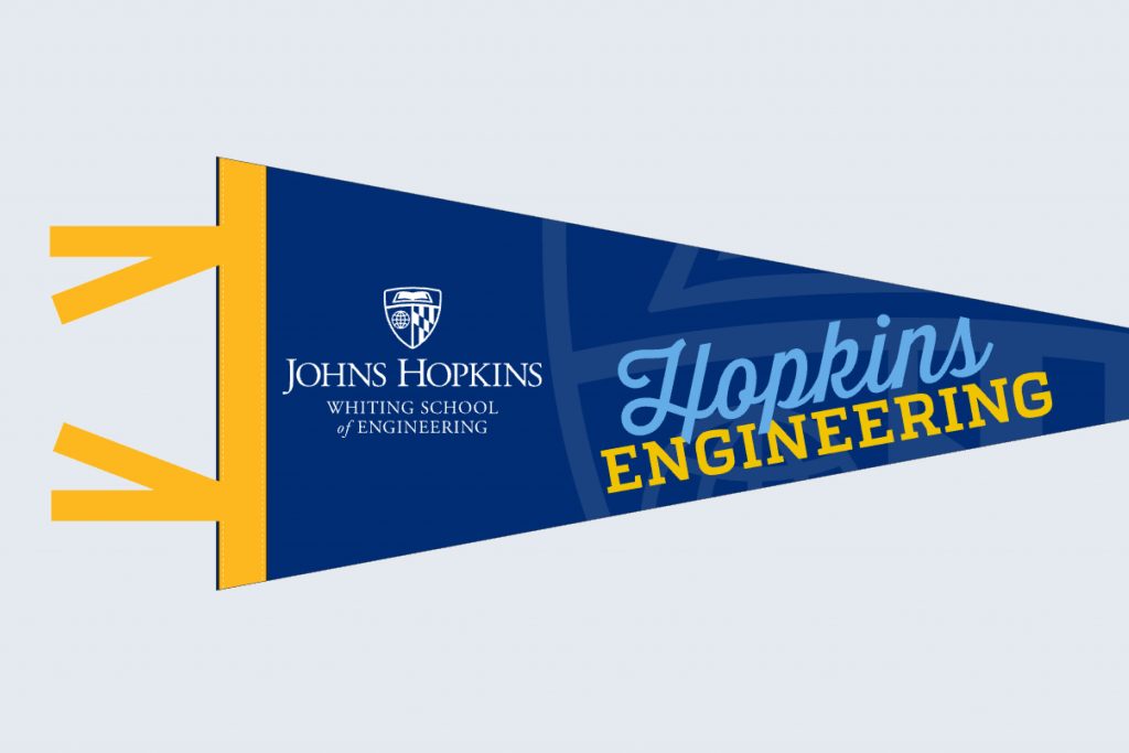
Quadon is a signature typeface for the Johns Hopkins brand—it is collegiate yet current and friendly. Quadon is strongest in display and impact applications, especially when the university’s personality needs to be expressed. It may also be used in headlines, subheads, and limited body copy applications. It is available in a variety of approved weights and formats.
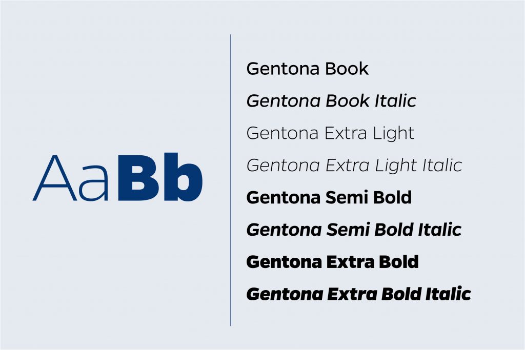
Gentona
Gentona, a sans serif font with a close typographic relationship to Quadon, is a body copy font that may also be used in headlines and subheads when Quadon is too casual for the communication or audience. Gentona is best used in situations where simplicity and legibility are paramount.
Secondary Typefaces
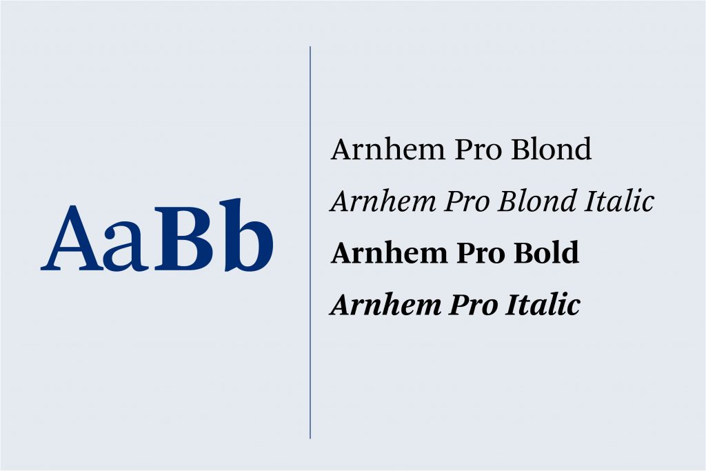
Arnhem
Arnhem is a serif font best suited for body copy, but it can be used for headlines, subheads, and typographic accents that require a traditional look. All caps use is not recommended. Arnhem is primarily used for editorial work.
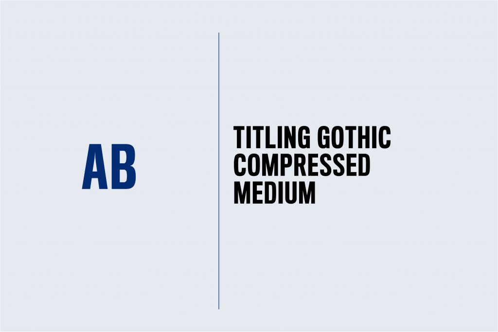
Titling Gothic
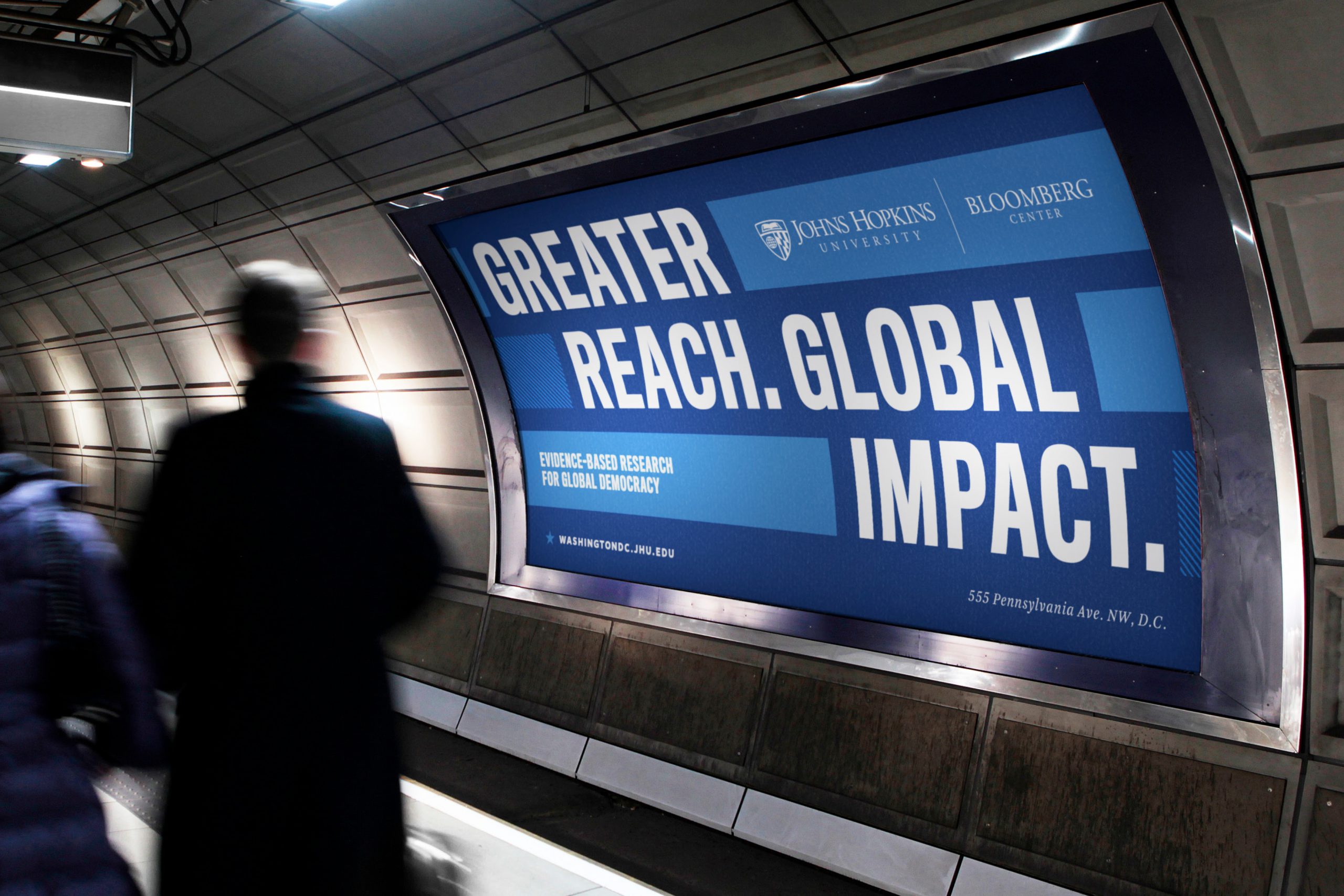
Titling Gothic is our limited-use, impact font. It is best suited for headlines and should be used only in all caps for short lines or phrases (between 10 and 15 words). Titling Gothic and Quadon both act as impact typefaces and therefore should have limited use together.
Request Fonts
Our primary and secondary brand typefaces are available only to Johns Hopkins University employees who are graphic designers. You can request these typefaces from University Communications or your divisional communications team. Fonts may not be shared without the knowledge of University Communications as licenses are limited. If you’re a non-marketing staff or an external consultant, you may purchase your own font license or consider a brand-approved font substitution.
Font Substitutions
There will be instances where the brand fonts cannot be utilized because of technical limitations or licensing restrictions. An example of this limitation is an HTML email in which attempts to include the brand fonts will likely fail. Please use the approved font substitutions below.
Platforms
Microsoft Office Suite
Canva
Websites & Online Applications
Designing with Type
Choosing the right typeface can set the tone for your design while reinforcing important brand attributes. Like many things in design, less is often more. And the consistent use of a few fonts adds visual strength to your work while making our overall brand more recognizable.
Type Pairings
Combining all four fonts in one document is not recommended. Instead, limit your font usage to two or three at most. The following illustrates suggested type combinations that work well together. These samples show the range of our typography options.
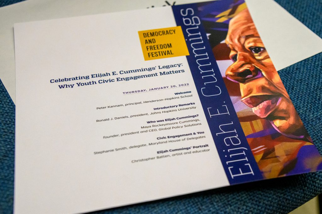
Quadon and Gentona
Our default recommended font pairing is Quadon for headlines and Gentona for body copy.
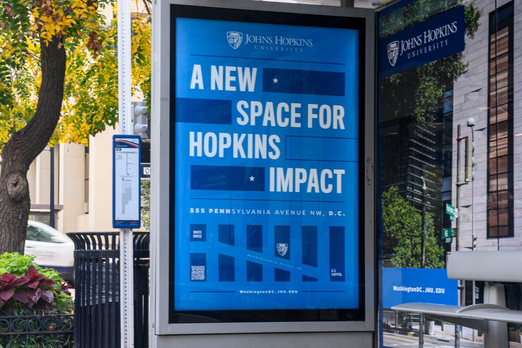
Titling Gothic and Gentona
Titling Gothic can be used for impact with Gentona as a body copy or accent.
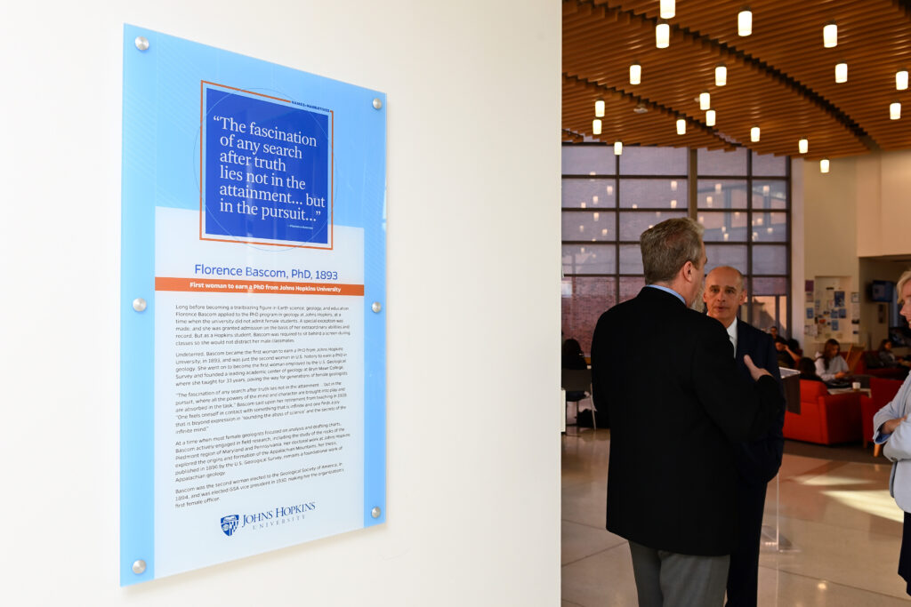
Arnhem
Arnhem brings formality to our brand and works well paired with Gentona.
Type Effects
Expand on our font library by applying effects and using typography in new and different ways in your designs. Think pattern and photo overlays, perspective effects, textures, drop shadows, and more.

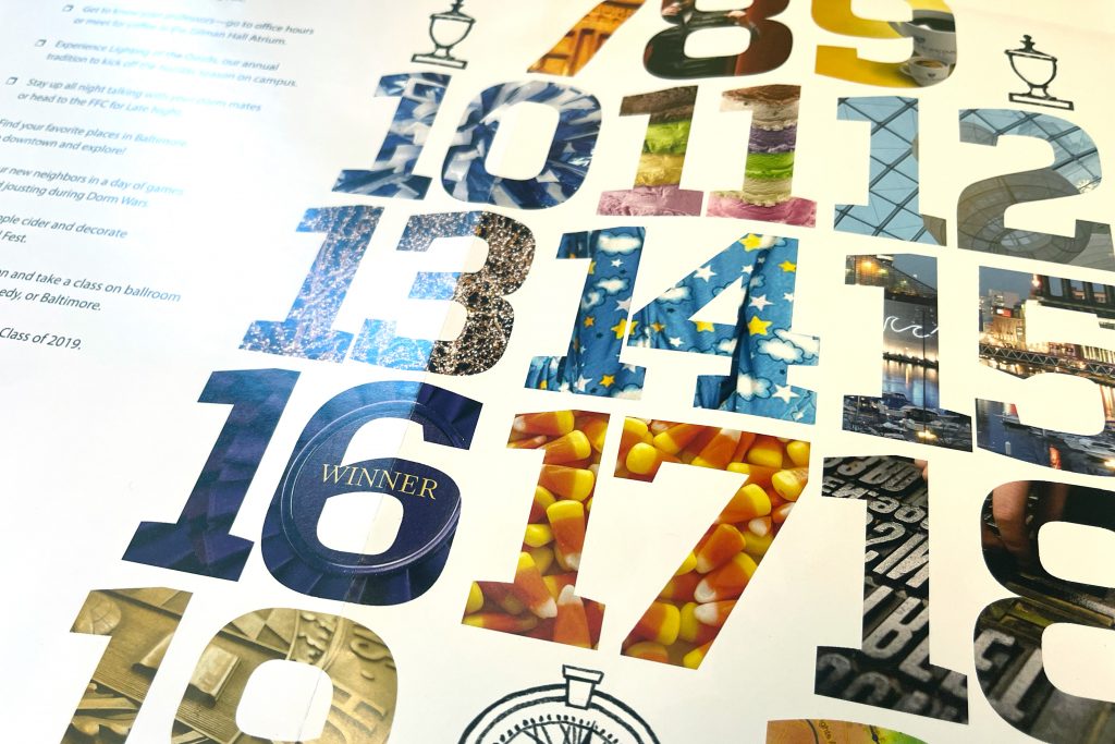

Type as Art
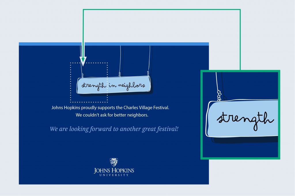
In instances where a typeface becomes part of an illustration, an alternative distinct typeface or hand lettering may be appropriate. You must ensure alternative typefaces are appropriately licensed for your use.
