April 21, 2025
Creating Branded Designs with Canva

Whether you use Canva Teams or a free account, there are plenty of opportunities to bring the Johns Hopkins University brand into your designs.
University Communications provides a few branded Canva templates for public use, including flyers, postcards, digital signage, and posters. These templates offer a quick option for creating on-brand marketing material. However, you might want to expand on those options by exploring Canva’s vast template library. With thousands of templates at your fingertips, you can choose the best one for your content needs. But how can you ensure your final design is aligned with the Johns Hopkins University brand guidelines? It might be easier than you think!
Think of your chosen Canva template as a house you just moved into, and it’s time to redecorate. We can paint the walls, add some new furniture, and maybe even update the flooring.
Customizing Colors
Let’s start with colors. Many of Canva’s templates include graphics and other design elements, like text, that can be customized with a user’s preferred colors. In this case, we’ll reference our brand’s color palette, specifically the HEX codes, when updating our template, focusing primarily on including Heritage Blue and/or Spirit Blue, and bringing in secondary colors as needed. To change the color, select your text or graphic element and choose Color from the toolbar that appears above. You can add in the Johns Hopkins brand colors by selecting “Add a new color” under the Document Colors heading in the Colors panel. If you need help, check out Canva’s video tutorial on changing an element’s color.
Tip: If no color tiles appear on the elements toolbar, it means you can’t change the element’s colors. When this happens, you have two options—leave the element in the design as-is or search Canva’s Element library for a replacement that can be customized.
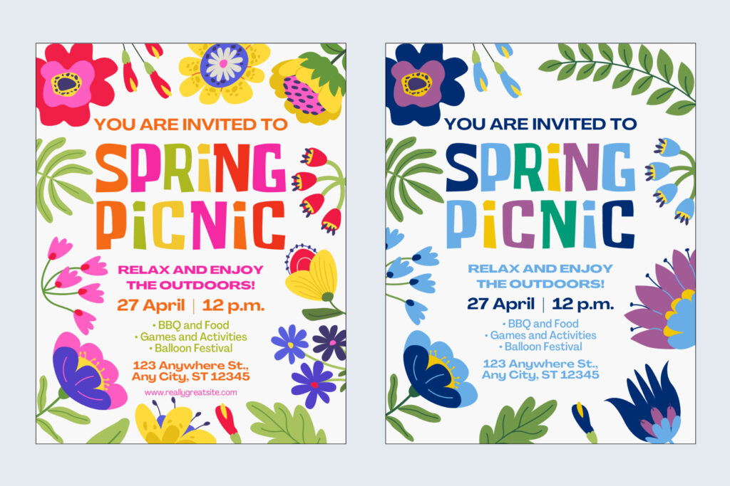
In the Spring Picnic design example above, we’ve updated the colors of the graphic elements and text to feature Heritage Blue and Spirit Blue. In addition, we included the secondary colors, Forest Green, Lime Green, Purple, and Gold to bring contrast and brightness to the design. A few of the flower graphic elements were swapped out because the originals did not allow color customization.
Font Substitutions
Another opportunity to align your creation with the Johns Hopkins brand is through typography. If you have access to a Canva Teams account, you can upload our open-source typefaces to Canva’s brand kit area.
If your template is using a unique font that adds artistic value to the design, such as in the Spring Picnic example above, it is acceptable to keep the specialty font as is and only update the secondary text to our brand substitutes.
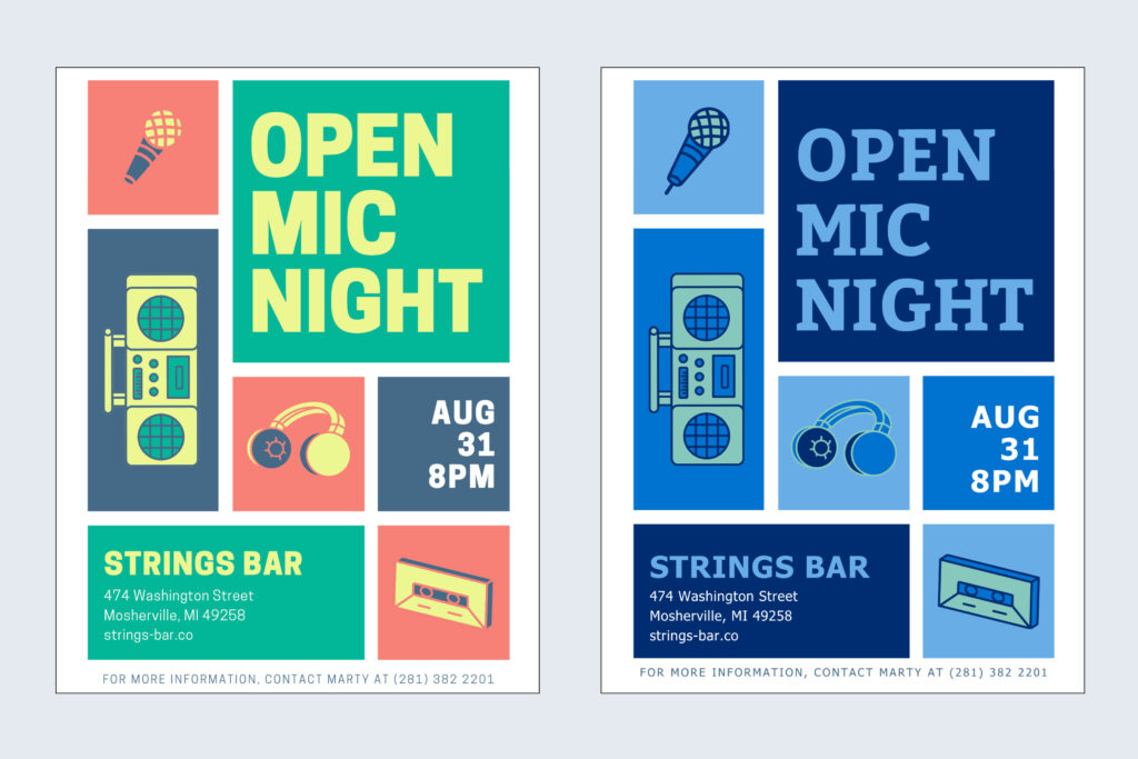
In the Open Mic Night example above, the template fonts were substituted with our open-source options, and the colors were updated to align to our brand palette.
Patterns & Icons
The Johns Hopkins University brand guidelines include ready-to-use graphic elements like patterns and icons. Our four brand patterns and the icon sets can be downloaded from this site and uploaded to your Canva design. The patterns make for great backgrounds—you can layer images, graphics, or text boxes on top for depth. While Canva’s Elements library is extensive, using one of our icons in place of a templated graphic is an easy way to make your design more consistent with our the Hopkins brand.
If your template uses one of Canva’s pattern graphics, there may be an opportunity for you to update the pattern colors for alignment.
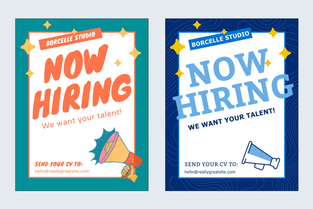
The above “Now Hiring” flyer example shows the Johns Hopkins Excellence pattern replacing the solid teal background. The fonts and colors have also been updated according to our brand guidelines. Finally, the megaphone graphic from the original template was replaced with the megaphone icon from our branded icon set.
Here are a few final thoughts before you go on your way to create beautifully branded Canva designs:
- If you plan to use your design in a digital capacity (on the web, social media, digital signage, etc.), accessibility, including appropriate color contrast and image alternative text, is your responsibility. Unfortunately, you can’t rely on Canva templates to automatically meet accessibility requirements—you should understand and check for these standards yourself. Please refer to accessibility.jhu.edu for more information.
- Access University photography for your designs via our photo library at jhu.edu/photolibrary. We also have a curated collection of video content that you can access at jhu.edu/videolibrary.
- Your design does not need to be perfectly aligned with the Johns Hopkins University brand. We appreciate any effort you put in to making these changes! Even small updates to Canva templates can make a big impact on brand consistency across our communication channels.
- If you’re looking for a less hands-on approach to creating on-brand marketing and communications materials, consider getting a Marq license. Marq is our branded template portal with more than 60 templates for you to choose from and customize with your text and imagery. All templates in the portal already use JHU logos, colors, fonts, and iconography, so there’s less work for you!