
Colors
Johns Hopkins University’s color palette is a critical component of our brand toolkit. The color system stems from an exploration of colors that appear in the buildings and grounds on our many campuses, as well as from existing divisional color palettes.
The deliberate selection of colors in our palette ensures alignment with our institutional messaging across all mediums, providing the user with a cohesive brand experience no matter where that may be.
The complete color palette is available for download to use in Adobe Creative Suite applications. This download includes both the primary and secondary colors in CMYK, PMS, and RGB, packaged as Adobe Swatch Exchange (ASE) files.
A Note on Color Builds
For color builds, use the color values listed below. They’ve been adjusted for the best reproduction in print and on-screen and do not match Pantone Color Bridge breakdowns. To serve people with impaired vision, some of our web color values have been altered slightly from print color values. Always use the hex color values listed here to ensure they meet accessibility standards.
Primary Colors
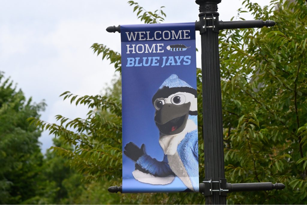
The official Johns Hopkins University color is blue—we are the Blue Jays, after all. And while Heritage Blue has emerged as the primary color associated with the university on the academic side, Spirit Blue can also be used to lighten the tone and bring “spirit” to your designs. At least one primary color, preferably Heritage Blue, should appear frequently and prominently across all communications and platforms.

HERITAGE BLUE
PMS 288 C
CMYK: 100, 80, 6, 32
RGB: 0, 45, 114
HEX: #002D72

SPIRIT BLUE
PMS 284 C
CMYK: 56, 18, 0, 0
RGB: 104, 172, 229
HEX: #68ACE5
Secondary Palette
Our secondary palette provides creative flexibility with neutral, cool, and warm accent colors. These should be used intentionally and sparingly—think 20% of the total color—to bring warmth and energy to your designs. It is never required to use a color from the secondary palette.
Cool Accent Colors
The cool accent color palette complements the primary colors through shades of blue, green, and purple. Refer to the accessibility guidelines below for more information about using Medium Blue and Harbor Blue.

Medium Blue
PMS 285 C
- CMYK: 90, 48, 0, 0
- RGB: 0, 119, 216
- HEX: #0077D8

Harbor Blue
PMS 279 C
- CMYK: 68, 34, 0, 0
- RGB: 78, 151, 224
- HEX: #4E97E0

Mint Green
PMS 564 C
- CMYK: 43, 0, 23, 0
- RGB: 134, 200, 188
- HEX: #86C8BC

Homewood Green
PMS 3278 C
- CMYK: 99, 0, 69, 0
- RGB: 0, 135, 103
- HEX: #008767

Forest Green
PMS 7734 C
- CMYK: 77, 0, 82, 65
- RGB: 39, 94, 61
- HEX: #275E3D

Lime Green
PMS 7490 C
- CMYK: 57, 6, 92, 19
- RGB: 118, 160, 76
- HEX: #76A04C

Lavender
PMS 666 C
- CMYK: 36, 39, 2, 5
- RGB: 158, 143, 176
- HEX: #9E8FB0

Plum
PMS 262 C
- CMYK: 58, 92, 12, 54
- RGB: 81, 40, 79
- HEX: #51284F

Purple
PMS 7655 C
- CMYK: 33, 72, 0, 0
- RGB: 164, 92, 152
- HEX: #A45C98
Warm Accent Colors
Warm accent colors in the red and orange family can provide additional lightness to your design. These colors should be used to highlight important features, like calls to action, or for visual style elements, like illustrations, graphs, and typographic accents.

Gold
PMS 7406 C
- CMYK: 0, 20, 100, 2
- RGB: 241, 196, 0
- HEX: #F1C400

Orange
PMS 1375 C
- CMYK: 0, 45, 94, 0
- RGB: 255, 158, 27
- HEX: #FF9E1B

Red-Orange
PMS 1505 C
- CMYK: 0, 56, 90, 0
- RGB: 245, 102, 0
- HEX: #F56600

Red
PMS 173 C
- CMYK: 0, 82, 94, 2
- RGB: 207, 69, 32
- HEX: #CF4520

Dark Red
PMS 187 C
- CMYK: 7, 100, 82, 26
- RGB: 166, 25, 46
- HEX: #A6192E

Maroon
PMS 188 C
- CMYK: 16, 100, 65, 58
- RGB: 106, 32, 43
- HEX: #6A202B

Sand
PMS 7407 C
- CMYK: 6, 36, 79, 12
- RGB: 203, 160, 82
- HEX: #CBA052

Light Brown
PMS 7586 C
- CMYK: 0, 69, 89, 41
- RGB: 150, 79, 46
- HEX: #964F2E

Dark Brown
PMS 4625 C
- CMYK: 30, 72, 74, 80
- RGB: 79, 44, 29
- HEX: #4F2C1D

Salmon
PMS 486 C
- CMYK: 0, 55, 50, 0
- RGB: 232, 146, 124
- HEX: #E8927C
Grayscale Colors
The grayscale color palette can enhance your designs by creating white space. This white space creates a clean and consistent space in which our primary colors, photography, and copy can be highlighted. The grayscale palette includes any tint of PMS Black 4C between 100% and 0% (white). Double Black may be used in situations where increased contrast is required, such as text over a color field.

White
- CMYK: 0, 0, 0, 0
- RGB: 255, 255, 255
- HEX: #FFFFFF

Double Black
- CMYK: 0, 0, 0, 100
- RGB: 0, 0, 0
- HEX: #000000

Sable
PMS Black 4 C
- CMYK: 41, 57, 72, 90
- RGB: 49, 38, 29
- HEX: #31261D
Pro-tip: Commencement Colors
Going back to the 19th century, our official school colors were “Old Gold and Sable,” which came from the seal of Lord Calvert. These colors can still be seen in our Commencement regalia today. So, why the change to blue? One of our early athletic opponents, Princeton University, donned the colors black and orange in competition. Our “Old Gold” was so similar to Princeton’s orange that it created confusion on the field—you couldn’t tell one team from the other! To avoid further confusion, Hopkins adopted black and blue as athletic colors, but kept black and gold as academic colors. The Board of Trustees approved specifications to use our academic colors in commencement regalia on June 6, 1892, stating that, “on all fitting occasions, a gown of the prescribed shape, made of either black silk or black stuff, and a hood made of black silk, lined with scarlet silk and edged with gold” should be worn by PhDs.
Gradients
Gradients can create depth and dimension within our brand when used deliberately as background elements or over photography. To maintain consistency and accessibility, we recommend that gradients:
- Be made up of at least 50% Heritage Blue.
- Use only primary and cool accent colors.
- Use a maximum of three colors.

Accessibility
When choosing colors for typography and backgrounds in digital applications, pay close attention to contrast and readability.
Johns Hopkins University follows the prevailing standard from the World Wide Web Consortium (W3C), which is the Web Content Accessibility Guidelines version 2.1, Level AA. This standard applies not just to websites, but to web applications developed or purchased by JHU, digital documents, videos, audio files, course content, and other EIT (Electronic and Information Technology).
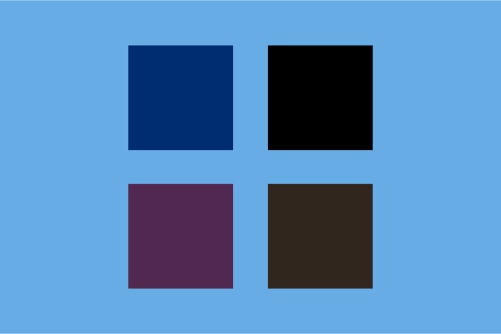
Color Combinations
WCAG 2.1 Level AA color contrast requirements specify minimum contrast ratios between text/graphics and the background:
- 4.5:1 for normal text
- 3:1 for large text (at least 19px tall and bold, or 21px tall)
- 3:1 for graphics and user interface components (such as form input borders)
To find accessible color combinations within the JHU brand palette, consult our color contrast grid. We’ve also highlighted some frequently used accessible color combinations below:

- Heritage Blue & White
- Heritage Blue & Spirit Blue
- Heritage Blue & Mint Green
- Heritage Blue & Gold
- Heritage Blue & Sand
- Heritage Blue & Orange
- Spirit Blue & Heritage Blue
- Spirit Blue & Black
- Spirit Blue & Plum
- Spirit Blue & Sable

- Black & Spirit Blue
- Black & Medium Blue
- Black & Mint Green
- Black & Homewood Green
- Black & Gold

- White & Heritage Blue
- White & Harbor Blue (Large text only)*
- White & Medium Blue
- White & Sable
- White & Homewood Green
- White & Forest Green
- White & Purple
- White & Plum

- Harbor Blue & White (Large text only)*
*Harbor Blue was added to the JHU color palette as an alternative to Spirit Blue due to its higher contrast ratio with the color white. However, Spirit Blue has a higher contrast ratio in many other approved combinations in our palette than Harbor Blue does. For this reason, Harbor Blue should only be used with white text or background. Spirit Blue is not accessible when combined with white text or background.
To check your color contrast, you can use a free tool such as the WAVE Color Contrast tool or the TPGi Color Contrast Analyzer.