Typography
Johns Hopkins University’s typefaces reflect our personality, diverse audiences, and goals by embodying our tone words: Strong, Bright, Useful, and True. To ensure all our communications and marketing materials share a consistent look and feel, the brand typefaces should always be used.
Important Note: On September 4, 2025, the university’s brand guidelines were updated to introduce open-source typefaces into our identity, including Work Sans, Roboto Slab, Source Serif 4, and Oswald. Our licensed typefaces, Gentona, Quadon, Titling Gothic, and Arnhem, will soon be retired as legacy typefaces and will have limited approved use cases within the brand. The new open-source typefaces closely match the personality and functionality of our licensed typefaces, but with the added benefit of scalability across brand platforms and users. Read our blog post for more information about this update.
Open-Source Typefaces
Our open-source typefaces are available for download on both macOS and PC systems by all students, faculty, and staff at the university and beyond. You can download the open-source typefaces for free from Google Fonts.
These typefaces can be used on nearly all communications platforms, including websites, social media, video, print, digital signage, etc. Please see Font Substitutions for use cases that require system default fonts.

Roboto Slab
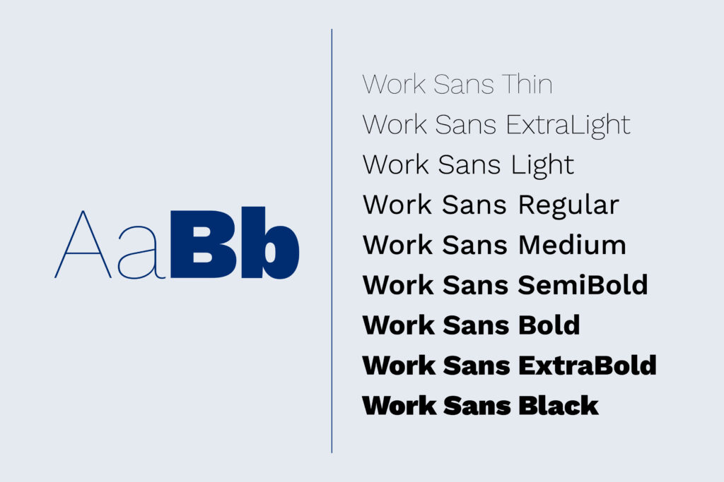
Work Sans


Source Serif 4
Licensed Typefaces
The licensed typefaces (Quadon, Gentona, Titling Gothic, and Arnhem) may not be used on any websites, mobile applications, or third-party cloud software (Marq, Canva, Adobe Express, etc.). In the event licensed typefaces are being used, please contact [email protected] for additional guidance on required remediation steps.
We’re in the process of retiring our licensed typefaces in favor of the above open-source alternatives. This transition plan is detailed in our recent blog post. For the Fall 2025 semester, the licensed typefaces may still be used on projects other than websites and mobile applications. Beginning in Spring 2026, our licensed typefaces will have limited use-cases within the brand.
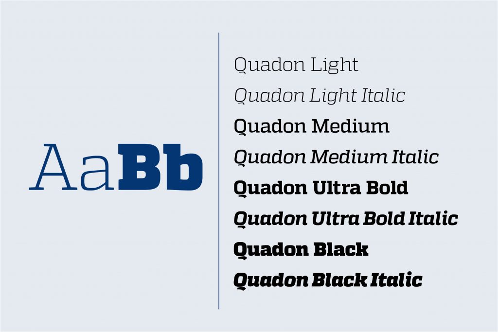
Quadon
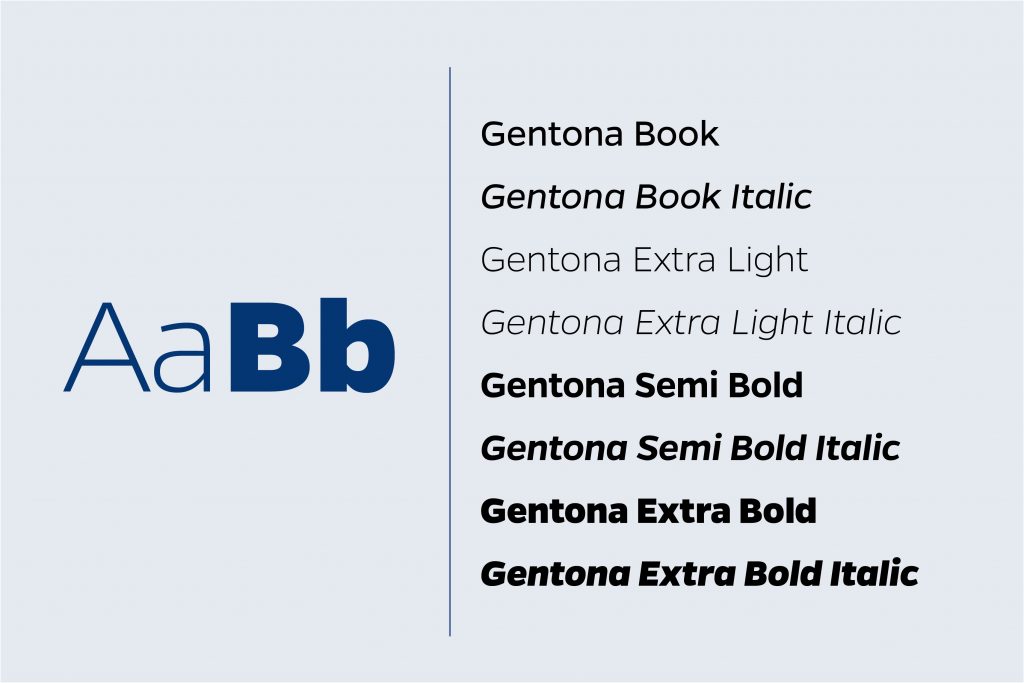
Gentona
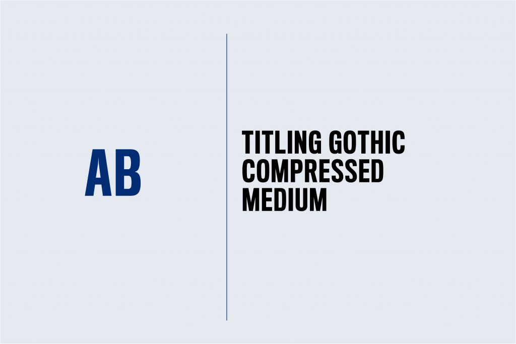
Titling Gothic
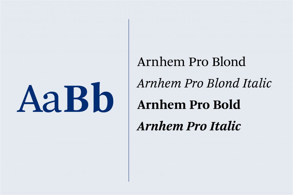
Arnhem
a note on adobe garamond
Adobe Garamond is strictly reserved for use in the Johns Hopkins University logo system. You may not retype the logo or use the typeface for any marketing materials.
Font Substitutions
There will be instances where the brand typefaces cannot be utilized because of technical limitations or licensing restrictions.
Platforms
Websites & Mobile Apps
System Defaults
Designing with Type
Choosing the right typeface can set the tone for your design while reinforcing important brand attributes. Like many things in design, less is often more. And the consistent use of a few fonts adds visual strength to your work while making our overall brand more recognizable.
Stylistic choices for our typography are left to the designer’s discretion. There are no requirements around kerning, leading, or tracking, though recommendations are available for specific use cases from [email protected].
Type Pairings
Combining all four fonts in one document is not recommended. Instead, limit your font usage to two or three at most. The following examples illustrate suggested open-source typeface combinations.
Roboto Slab & Work Sans
Pairing Roboto Slab with Work Sans is casual and great for a student or athletics audience. Roboto Slab shines as a display headline font, while Work Sans is best for body copy in this pairing.
Oswald & Work Sans or Source Serif 4
Oswald is impactful as a flexible display typeface. Pair it with Source Serif 4 for more formal applications or Works Sans for casual or playful designs.
Source Serif 4 and Work Sans
For professional or formal communications, pair Source Serif 4 with Work Sans. Source Serif 4’s italics variations are elegant without being difficult to read. Work Sans is a neutral font that is beautiful in any application, whether used as a display font or an accent.
Type Effects
Expand on our font library by applying effects and using typography in new and different ways in your designs. Think pattern and photo overlays, perspective effects, textures, drop shadows, and more. Send us your best JHU examples of type effects for our brand showcase!
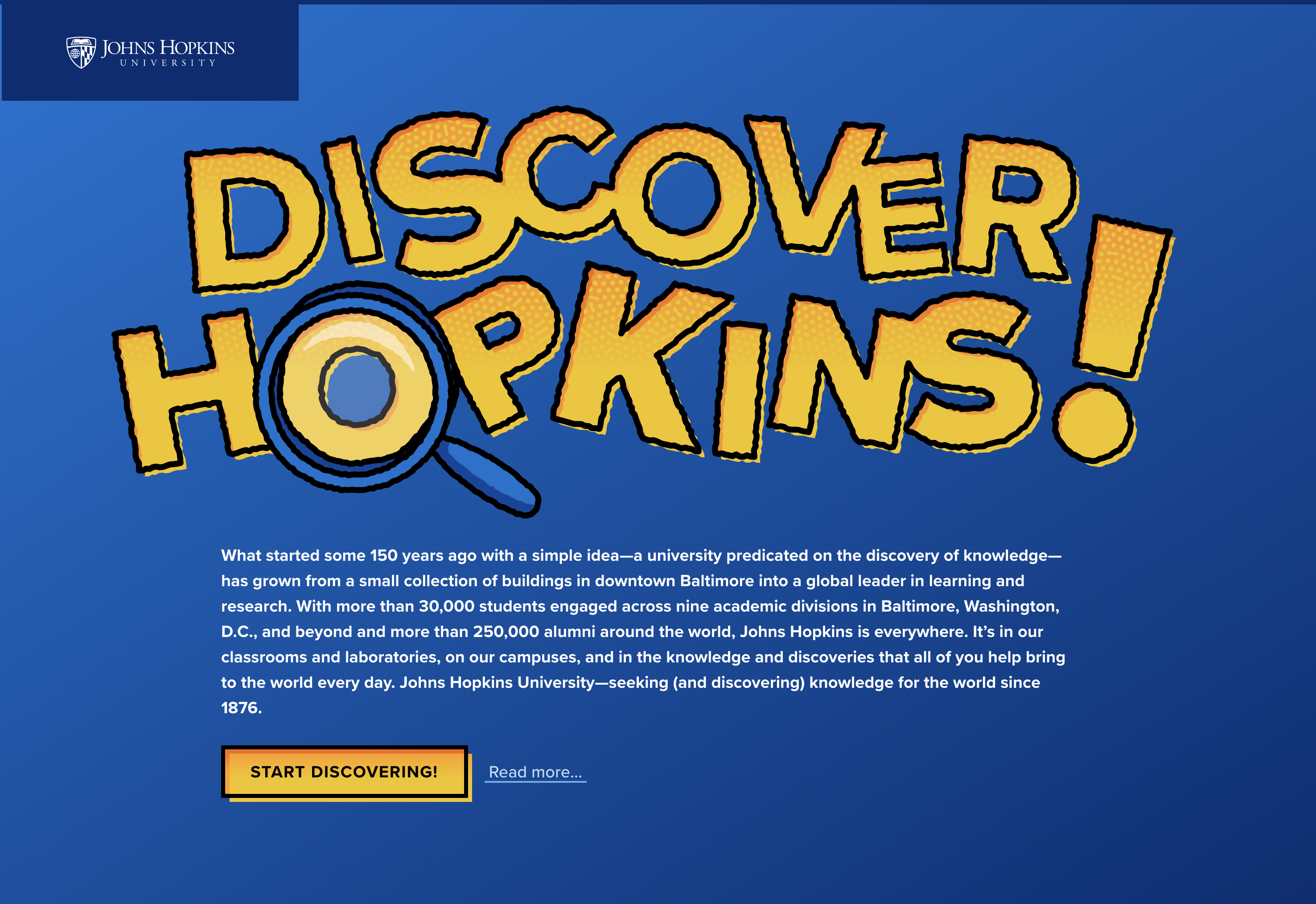
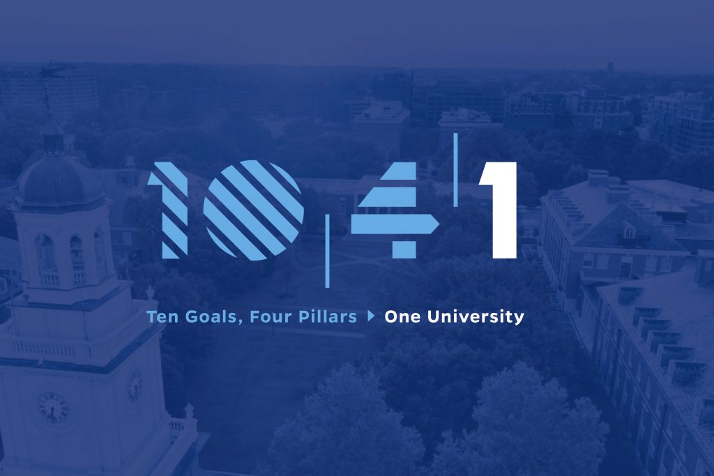

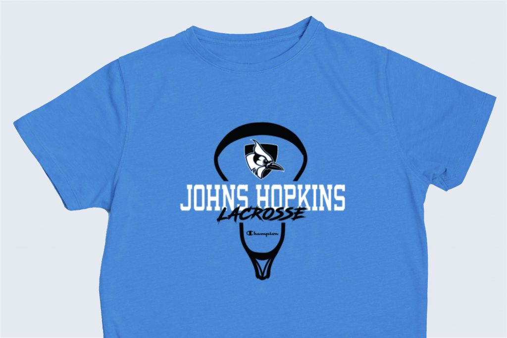
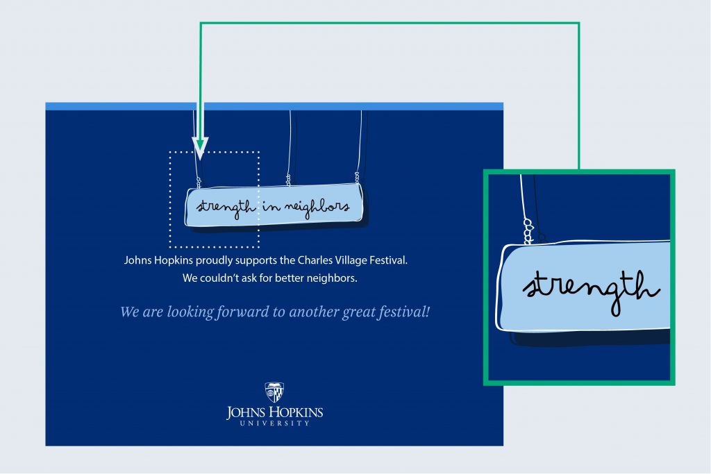
Type as Art
When a typeface becomes part of an illustration, an alternative, distinct typeface or hand lettering may be appropriate. You must ensure alternative typefaces are appropriately licensed for your use.