
Visual Identity
The Johns Hopkins University shared visual identity reflects the excellence and vastness of this great institution.
These guidelines were developed with input from marketing and communications professionals from across the university. The resulting system presents Johns Hopkins as a world-class, integrated yet diverse university that builds on the strengths of its many parts to make the whole even stronger. And a stronger Johns Hopkins University benefits us all.
Just like Johns Hopkins University, our visual identity will continue to evolve to meet the latest best practices and standards. Visit the Brand Blog to follow along as we update our guidelines and share best practices!
Logos & Lock-ups
Take care in choosing the right logo for your communications and following the guidelines outlined here. Refer to our Legacy Marks to avoid using outdated brand elements and logos.

Primary Logo
Our most recognizable visual is the primary Johns Hopkins University logo. When in doubt, use this logo on communications, as it represents all corners of the institution.
View Primary Logo
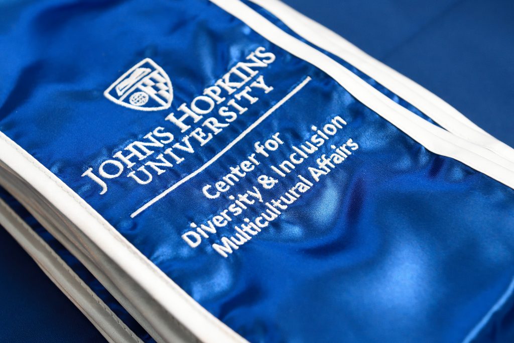
Logo Lock-Ups 
All division institutes and centers, as well as academic and administrative departments, are part of our shared brand. It benefits all our interests to present a clear and consistent association with each other and the institution through our unified logo architecture. As such, custom logos are not permitted.
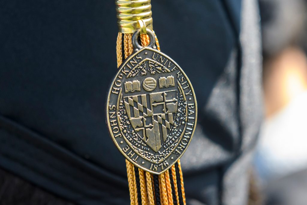
University Marks 
The Johns Hopkins University brand includes various supporting marks, each with its own use case and guidance. These marks uniquely articulate our brand and are limited in circulation to preserve their intended purpose.

Athletics Marks 
The official Johns Hopkins Athletics logos and marks contribute to and enhance an intercollegiate athletics program that is among the most successful in the nation.
A Note on Co-branding
Johns Hopkins University promotes external partnerships and interdisciplinary collaboration across divisions, departments, and units as part of our One University commitment. Successful co-branding of these partnerships should always uphold Johns Hopkins’ brand identity and recognize external partners appropriately.
Secondary Graphics
Secondary graphics, including illustrations and type treatments, are occasionally permitted for time-bound events and campaigns, merchandise, and unit sub-identities. Secondary graphics are not logos. These secondary graphics are designed to be just that – secondary to our primary logo and official marks.
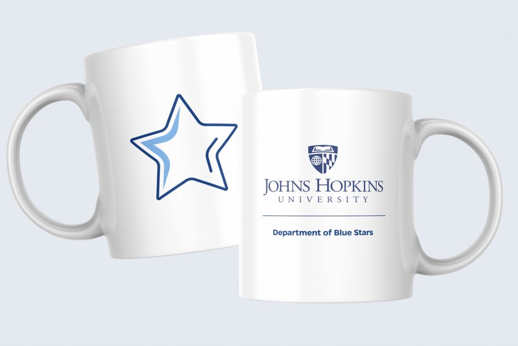
Unit Accent Graphics 
In addition to our university-wide graphic elements, some units may want to create a unique design element (referred to as a unit accent graphic) that represents their mission.

Event Graphics 
Custom event graphics can be considered for time-bound events and campaigns, with special consideration given to events with external audiences.
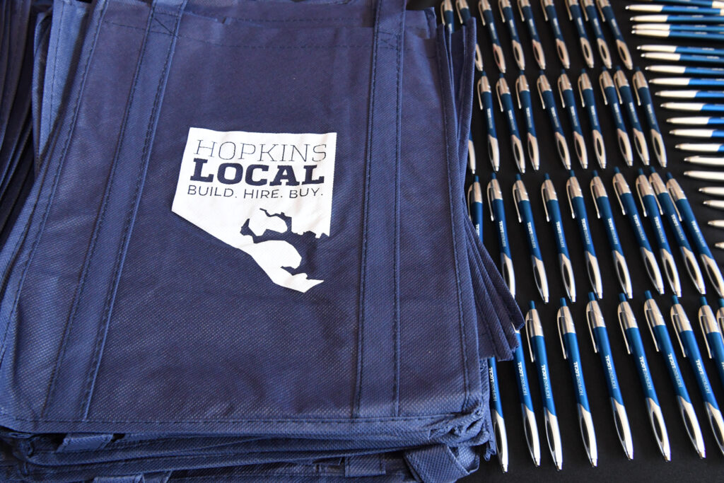
Unique Merchandise Graphics 
If you’re creating promotional items for your group, you may want to use a creative illustration or typographic design to represent your goals.
Design Assets
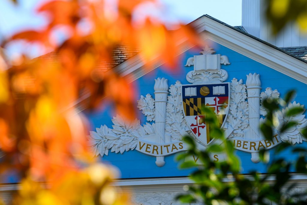
Colors
The university color system stems from an exploration of colors that appear in the buildings and grounds on our many campuses, as well as from existing division color palettes.
View Color Guidelines
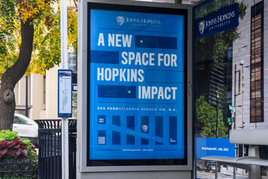
Typography
Our four brand typefaces reflect JHU’s personality, diverse audiences, and goals. Choosing the right typeface can set the tone for your design while reinforcing important brand attributes.
View Typography Guidelines
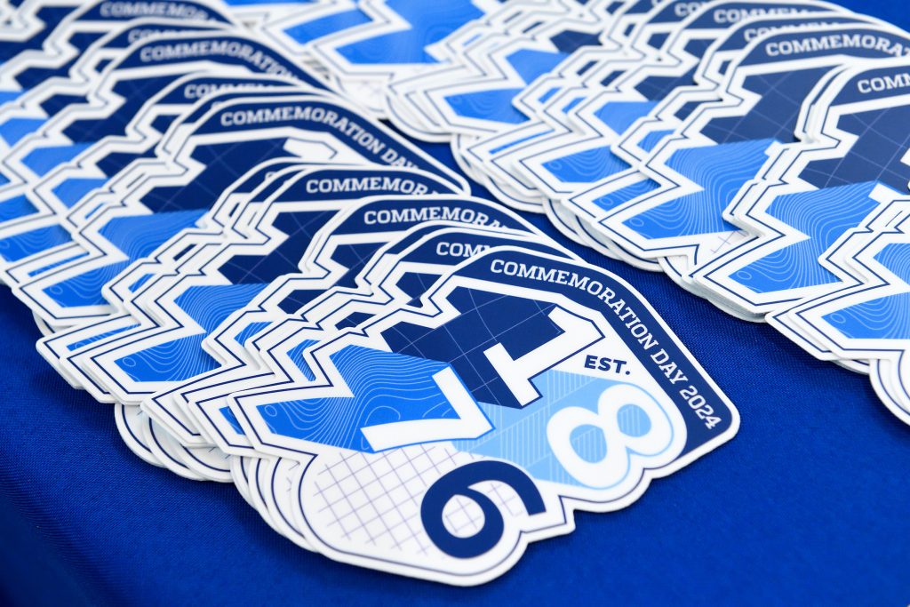
Graphic Elements
Our official graphic elements offer additional visuals that can be used across Johns Hopkins University to create unique designs while also providing continuity throughout our collective communications and marketing.
View Graphic Element Guidelines

Photo & Video
Photo and video are powerful mediums for capturing the essence of the Johns Hopkins University brand and telling the story of our unique identity, values, and the atmosphere of our university community.
View Photo & Video Guidelines
Brand Showcase
Together, our work is the visualization of One University. View our creative showcase for a collection of finished works representing the Johns Hopkins University brand across platforms, audiences, missions, and more.