Enterprise Branding
For communications materials that represent the totality of the Johns Hopkins ecosystem, enterprise brand guidelines should be applied.
As collaboration across the Johns Hopkins ecosystem continues to grow, so too do our guidelines around enterprise branding. What began as the joint University & Medicine wordmark within the Johns Hopkins University brand architecture has evolved into the stand-alone wordmark and guidelines around color, typography, and supporting visuals. These guidelines apply not only to the original use case of shared sponsorships but also to an increasing number of shared services, initiatives, and campaigns spanning the ecosystem, such as Johns Hopkins’ 150th anniversary.
To determine if enterprise branding is appropriate for your communication, you must think strategically about your audience. If you are communicating to a university-specific audience (JHU faculty and staff, current/prospective students and families, etc.), please refer to the Johns Hopkins University primary logo and guidelines. If you are communicating to a medicine-specific audience (patients, JHM employees, etc.), follow the Johns Hopkins Medicine brand guidelines. Only when your message and audience truly span the Johns Hopkins ecosystem (community-focused programming, enterprisewide tools, etc.) is it permitted to use enterprise branding.
Stand-Alone Wordmark
The Johns Hopkins stand-alone wordmark is derived from Johns Hopkins University’s primary logo and was debuted as part of our sesquicentennial celebration identity.
The stand-alone wordmark will replace the joint University & Medicine wordmark following the conclusion of the sesquicentennial celebration. This wordmark represents the entire Johns Hopkins ecosystem, and its use is strictly limited. The stand-alone wordmark is not a substitute for the JHU, JHHS, or JHM logos.
All stand-alone wordmark use cases must be approved by University Communications. As such, this mark is not available for download, but may be requested via an email to [email protected].
Note: Per internal co-branding guidelines, to avoid redundancy in a design and provide clarity to our audiences, the Johns Hopkins University logo and Johns Hopkins Medicine logo may not be used together.

Colors
Enterprise-branded materials should rely on the following primary and preferred accent colors. The primary color, Heritage Blue, should appear frequently and prominently across all communications and platforms. The preferred accent colors, Gold and Spirit Blue, should be used as needed to add contrast and energy to your designs. If additional colors are required for your work, please reference the full Johns Hopkins University color palette.

Primary: Heritage Blue
PMS 288 C
- CMYK: 100, 80, 6, 32
- RGB: 0, 45, 114
- HEX: #002D72

Preferred Accent: Gold
PMS 7406 C
- CMYK: 0, 20, 100, 2
- RGB: 241, 196, 0
- HEX: #F1C400

Preferred Accent: Spirit Blue
PMS 284 C
- CMYK: 56, 18, 0, 0
- RGB: 104, 172, 229
- HEX: #68ACE5
Typography
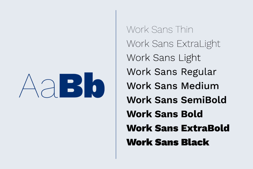
The primary typeface for enterprise branding is Work Sans. As an open-source typeface, Work Sans is available for free download from Google Fonts. If additional typefaces are required, please refer to the Johns Hopkins University open-source typography palette.
Supporting Visuals
When designing materials that represent all facets of our institution, from academics to spirit, to patient care, we lean on our universal brand identity elements. Context and audience are especially important here—these visuals are most effective for internal staff campaigns, alumni affinity communications, and Baltimore community partnerships.

JH Monogram
Derived from the stand-alone wordmark, the JH Monogram is a shorthand visual representation of the entire Johns Hopkins ecosystem. This abbreviated mark is ideally suited for use on merchandise, in limited-space applications, and as a background element.

Shield Mark
The JHU shield mark can be used in enterprisewide communications. However, no other Johns Hopkins iconography (division-specific shields or JHM triangle symbol) can be used on enterprise communications.

Hopkins Block Text
The Hopkins Block Text graphic sets the Hopkins name in a collegiate style along an arched path for a classic look with broad appeal. It’s best suited for use on merchandise giveaways geared toward an enterprisewide audience.

Patterns
Our graphic patterns offer a shared visual texture across Johns Hopkins. They work particularly well as background textures, both at small and large scale.

Spirit Marks
Our spirit marks were created to evoke a sense of energy and Johns Hopkins pride. They’re ideally suited to represent Hopkins Athletics but are available for use across the enterprise to support brand affinity.

Imagery
Coming soon!
a note on est. years
While there are individual milestones to mark the founding of Johns Hopkins Hospital (1889) and many other divisions and departments across the Johns Hopkins ecosystem, 1876 is when our collective story begins. For this reason, our 150th anniversary campaign introduced the stand-alone Johns Hopkins wordmark as part of our brand architecture.
Division Sub-Identities
When supporting enterprise branding, it’s important to take into account that many departments and divisions within the Johns Hopkins ecosystem have distinct sub-identity considerations. Depending on the message, platform, and audience for your enterprisewide materials, you may need to layer elements from specific sub-identities into your communications. Stylesheets for approved sub-identities within the Johns Hopkins University brand will be available soon. In the meantime, please email [email protected] for guidance.