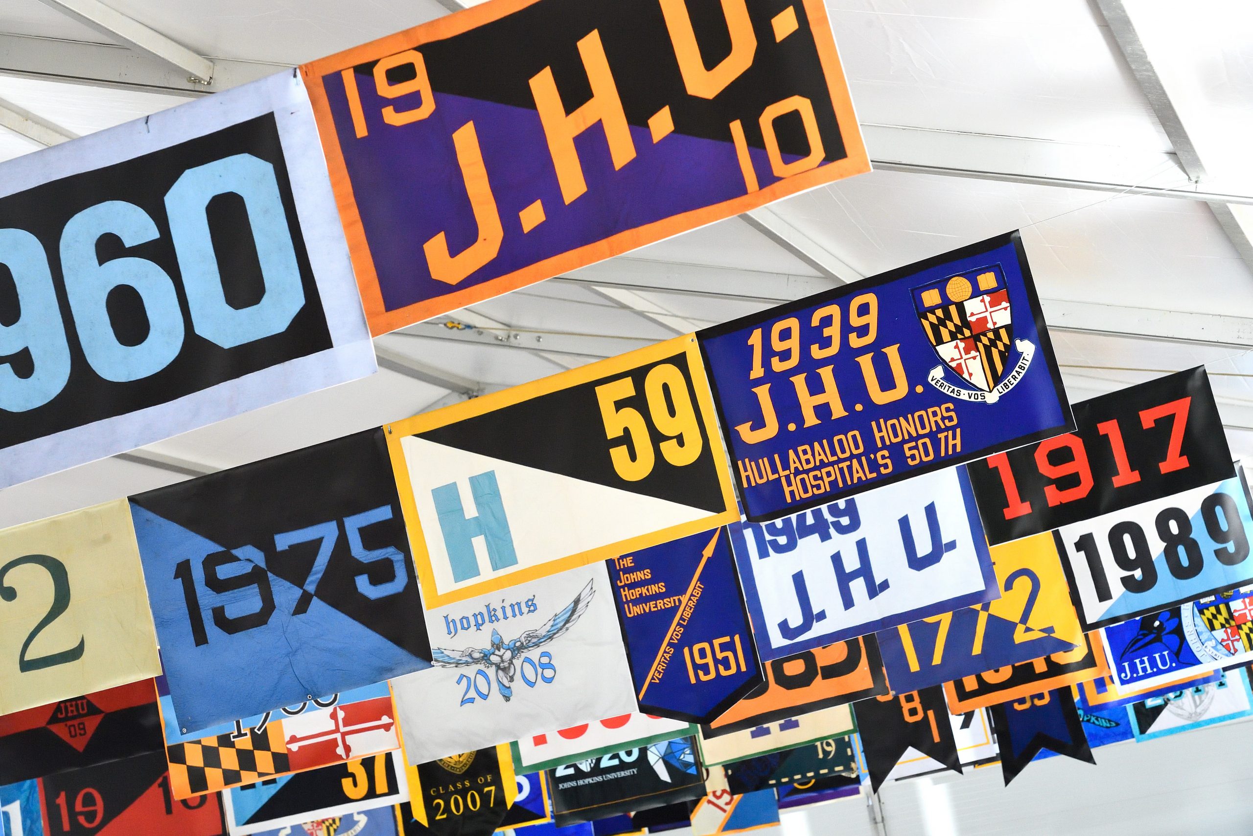
Legacy Marks
Just like the University, our brand guidelines continue to grow and evolve over time. As such, there are times when specific graphics are retired from use.
While we can’t retract files that have inevitably circulated, we have highlighted legacy marks below to help retire them from use. For official logo files, it is best practice to visit our Download Library.
Retired University Logo
Before 2013, Johns Hopkins University used a typographic logo. This is no longer an official representation of the university, and all instances should be updated to our primary logo.
Retired Logo
Retired logo as of 2013. This logo does not include our shield and uses a different font than the current logo.
Current Logo
Our current logo, as seen in the Brand Guidelines.
“Large” Logo & Shield
The 2013 logo architecture included both large and small versions of all logos and shields. The large versions of the files were retired to streamline file management and version control.

Large Logo
Legacy large versions of the University logo and shield include five lines in the globe and a thinner stroke on the white shield outline.

Small/Current Logo
The correct version of the University logo and shield only includes three lines in the globe.
Joint University & Medicine WordMark
The stand-alone Johns Hopkins wordmark was debuted as part of our sesquicentennial celebration identity. It will replace the joint University & Medicine wordmark following the conclusion of the sesquicentennial celebration. The joint University & Medicine wordmark and the stand-alone Johns Hopkins wordmark have limited use cases, and files must be requested from [email protected].
Retired Wordmark
Retired in 2025, this limited-use mark should no longer be used in new designs.
Current Wordmark
The current stand-alone wordmark removes the words “University & Medicine,” but still represents the entire Johns Hopkins ecosystem.
Johns Hopkins’ Signature
Johns Hopkins’ signature graphic was retired in 2020. Where legacy uses of this graphic still exist, it should not be used for new designs.
Jay Mascot Costume
The Jay mascot costume was updated in 2019. Photography and collateral including the legacy Jay mascot costume should be updated.

Retired Jay Mascot
The former Jay costume is most easily identified by its teeth and a blue beak.

Current Jay Mascot
The current and correct Jay mascot costume does not have teeth, is close in color to our official Spirit Blue, and wears sneakers. Download mascot photo set.
Retired Athletics Logos
First Athletics Logo (1966–1995)
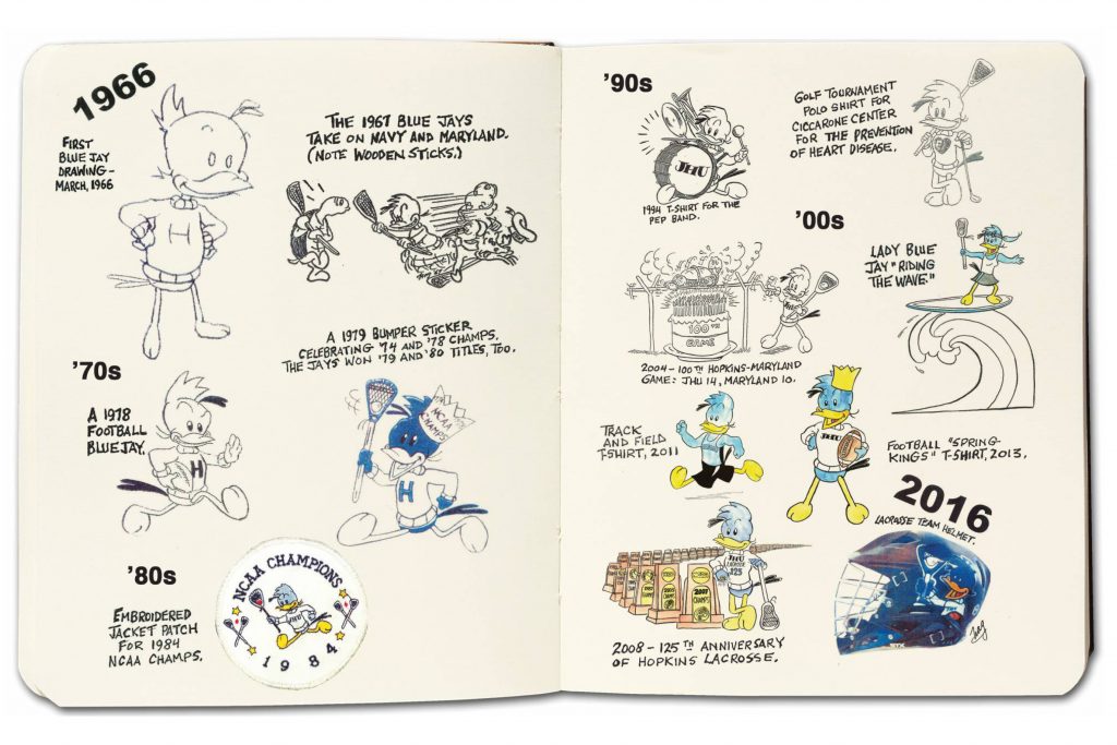
A 1969 Johns Hopkins graduate, Neil A. Grauer created the first Blue Jay athletics mascot illustration, better known as the “NAG Jay,” which served as the official logo of the Department of Athletics from 1966 through 1995.
The legacy NAG Jay illustrations are strictly limited and cannot be used as a substitute for the University Athletics logo or official sports logos.
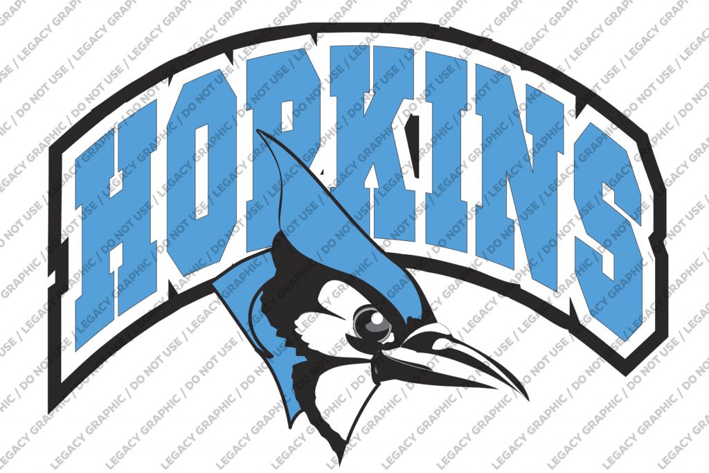
Legacy Athletics Logo (1995–2014)
Jayne White was commissioned to draw the above graphic as an updated Athletics logo. This graphic first appeared on men’s soccer uniforms in 1995 and served as the inspiration for the now current logo that was created by the University Communications office in 2014. This logo should not be used and legacy uses should be updated to leverage the current Athletics logo.
Current Athletics Logo (2014–Present)
The current athletics logo was introduced in 2014. Visit the Athletics page for more guidelines specific to this logo.