Unit Sub-Identities
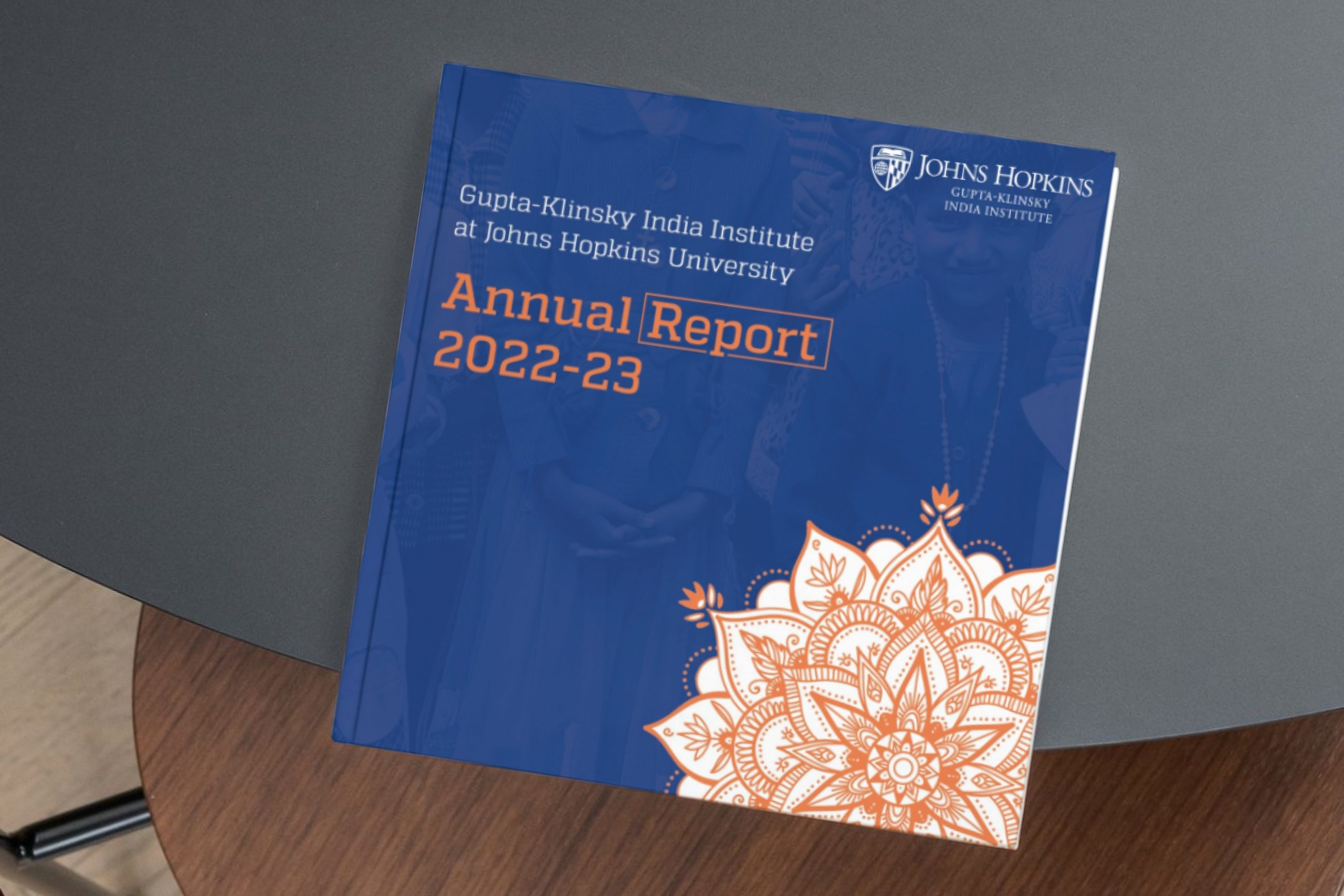
Our brand guidelines offer a variety of tools to foster flexibility and creativity in your department’s communications. From accent colors to typography combinations, photography to key messages, the success of this adaptability relies on having a shared foundation to draw from—the Johns Hopkins University brand.
Unit Lock-ups
Unit lock-ups are the official marks for all division institutes and centers, as well as academic and administration departments. If you need access to your department’s lock-up bundle, search our library.
Custom logos are not permitted within the Johns Hopkins University brand architecture because they dilute JHU’s established brand equity and recognition.
Accent Graphics
In addition to our university-wide graphic elements, some units may want to create a unique design element that is used consistently to represent their mission and tailor their communications to a specific audience. This design element is not to be confused with a logo and is referred to as an accent graphic. It may not include the name of your unit or reference to Johns Hopkins University (or a division, center, etc.) to avoid appearing as a competing logo. The University Communications creative team is not able to provide individual design support for the creation of these graphics but can advise on appropriate usage and provide approved examples from other units.
When an accent graphic is used, the unit’s official lock-up or the primary logo must also be included prominently, and the two marks must be placed with adequate spacing, so they don’t look like a combined logo. The accent graphic is meant to be a subtle, complementary design element in your communications.
Logo vs. Accent Graphic
Official unit lock-up provided by University Communications or your division’s communications team.

Supporting accent graphic, created by the unit. This can use graphic or typographic elements.
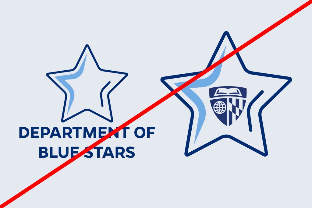
Accent graphics cannot include typographic references to JHU or the department name. They may not contain any JHU logos or official marks.
Accent Graphics in Context
Keep in mind that your unit accent graphic does not need to be used across all communications and merchandise for your unit to establish recognition across the community. Instead, community recognition and trust come from the consistency of your messaging, effective event and mission promotion, and a direct connection to the Johns Hopkins brand.
Examples of an accent graphic being properly used as a secondary graphic with an official logo or lock-up:
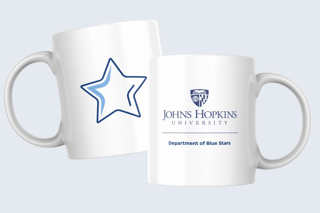
Merchandise
Accent graphics can be used on promo items and apparel, but they must be accompanied by the official unit lock-up or a primary logo in a secondary imprint location. The graphic and the logo can be included within the same imprint location only if adequate space is provided (at least the height of three shields). See the Merchandise page for more examples.
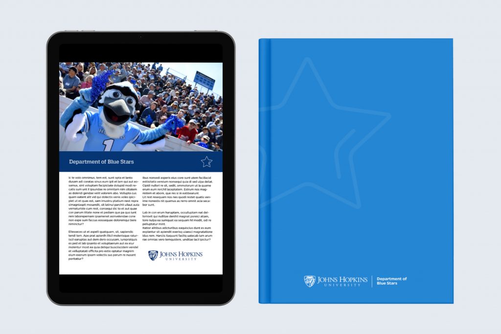
Marketing Materials
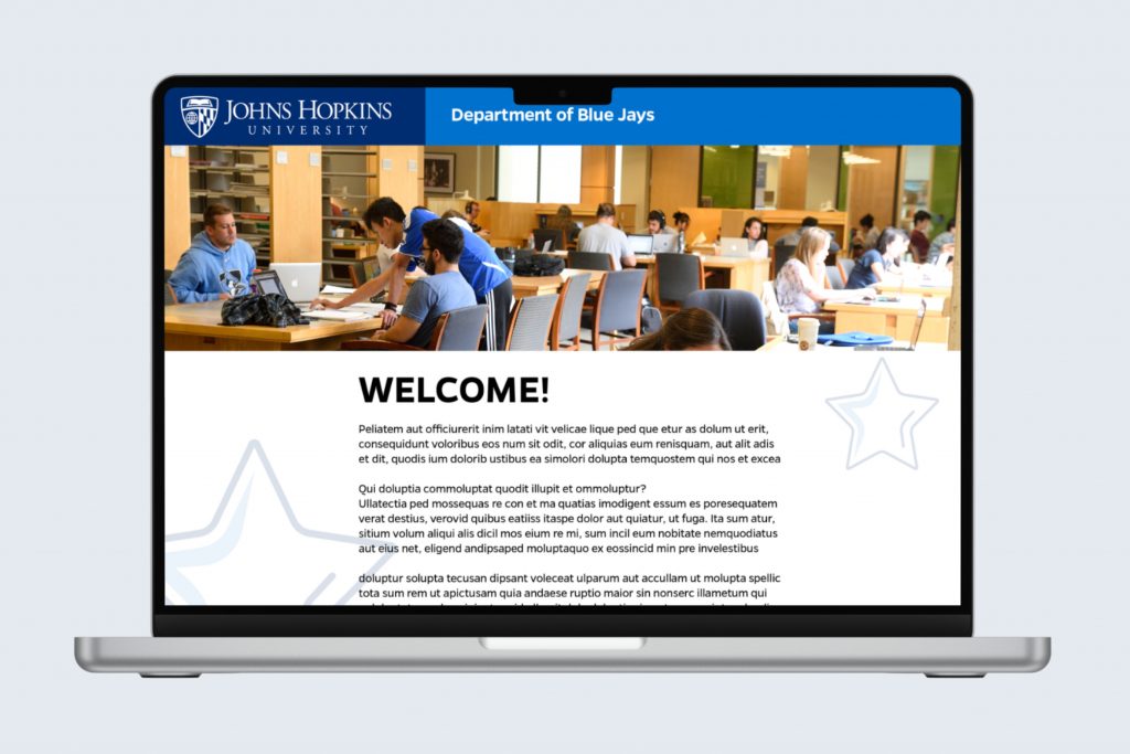
The accent graphic can be used on print and digital marketing materials, but it must be accompanied by the official unit lock-up or a primary logo. Accent graphics work most effectively when used as subtle background elements.
Note: Accent graphics may not be used on any official stationery, including business cards, letterhead, envelopes, etc., or email signatures.
Websites & Emails
Accent graphics may be used on websites and marketing emails, but a primary logo must be used in the header and footer. The accent graphic should be just that, an accent on the page, not the primary identifier in the top navigation.
Note: Accent graphics should not be used as favicons or social media profile images.
Style Sheets
When an approved strategic need arises, additional stylistic choices beyond an accent graphic can be made to tailor the Johns Hopkins brand to better suit your unit.
For units with a unique strategic need, including but not limited to marketing a product or service to an external audience; differentiating from a similar unit within the institution; or a mission-driven reasoning, a supplemental style sheet can be created to define the sub-identity. Your unit must make these stylistic choices in partnership with University Communications.
Sub-identities can contain some or all of the following elements:

Color Palette
While one of our primary colors should remain core to your palette, selecting a narrowed–down set of secondary colors from within the brand palette can convey a mood and style that is specific to your unit’s mission. Gradients can also be used.

Patterns
Johns Hopkins University has official brand patterns from which units can pull, or they can create their own custom patterns and textures.
Typography
Our extensive typography library allows units to use the approved typefaces and weights that align most closely with their audience.
Iconography
Official icon set expansion packs can be created to support marketing content needs on the web and in print.
Accent Graphic
A sub-identity should include guidance on the usage of an accent graphic (if one exists).

Photography
In some cases, photo styles can be called upon in establishing a sub-identity, such as duotone overlays, specific crops, or highlighted subject matter.