Primary Logo

The primary university logo is the core of the Johns Hopkins University visual identity.
It is essential that we maintain the prominence and recognition of the official Johns Hopkins University logo and its subsidiaries. None of the elements may be altered in any way, nor can individuals create their own logos or shields. Use only the digital artwork provided by University Communications on this website. To avoid introducing additional shields, secondary graphics cannot include or be framed in the shield shape.

Vertical Logo

Horizontal Logo
Logo Anatomy

Shield
Our logo’s iconography is based on the university’s academic seal. The open book represents knowledge and discovery, the globe signifies the university’s worldwide reach and responsibility, and the crest of Lord Baltimore is emblematic of the university’s commitment and connection to its community. These elements are framed in a shield that is a shared visual among all our schools and divisions.

Wordmark
The wordmark is a custom letterform and cannot be replicated by typing the letters.
The wordmark may never be used without the shield or be broken up into parts.

Logo
The shield and wordmark are collectively known as the logo.
Division Logos
Ten official divisions have logos combining the university or a division-specific shield with the Johns Hopkins name and division name. In unique circumstances where divisions had distinct original graphics before our 2013 rebrand, those graphics were incorporated into a division-specific shield. Division logos all utilize the same shield shape and logo architecture to position ourselves as One University. All primary logo and shield usage guidelines, including color, size, clear space, etc., apply to the division logos and shields.

Color Usage
All logos and lock-ups within the Johns Hopkins University architecture must be used in our approved brand colors: Heritage Blue (PMS 288), white, or black. No other logo colors are acceptable and logo files may not be altered to change the color.

Heritage Blue Logo
The Heritage Blue logo must be used on white or light backgrounds.

White Reversed Logo
The white reversed logo must be used on dark backgrounds. The white logo files will always contain an outlined shield, rather than a filled shield.

Black Logo
All logos are available in one-color, black variations for use in newsprint and other black-and-white applications.
Incorrect Logo Colors
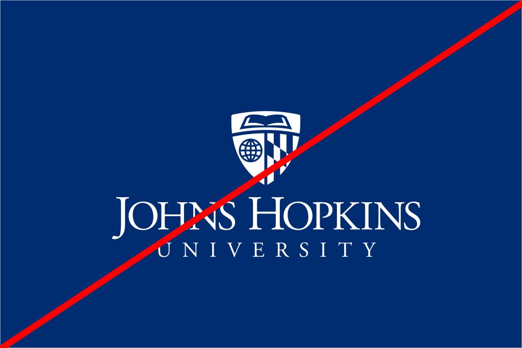
Do not recolor the blue logo to achieve the white logo. This is a common error and doing so results in an incorrect reproduction.
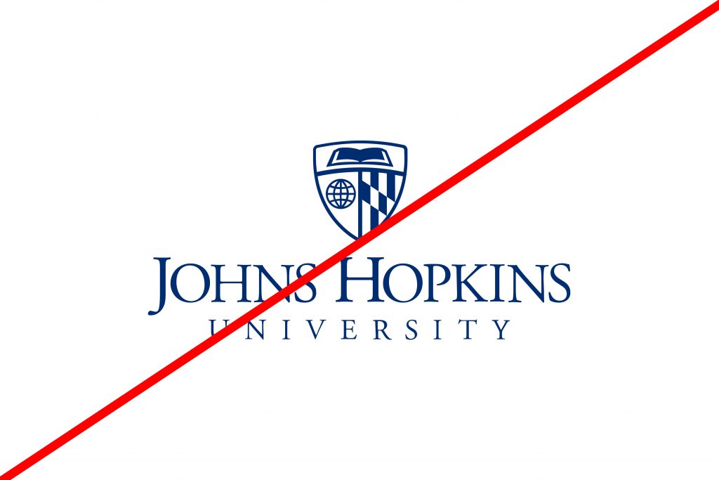
Do not recolor the white logo to achieve the blue logo. Doing so results in an incorrect reproduction.
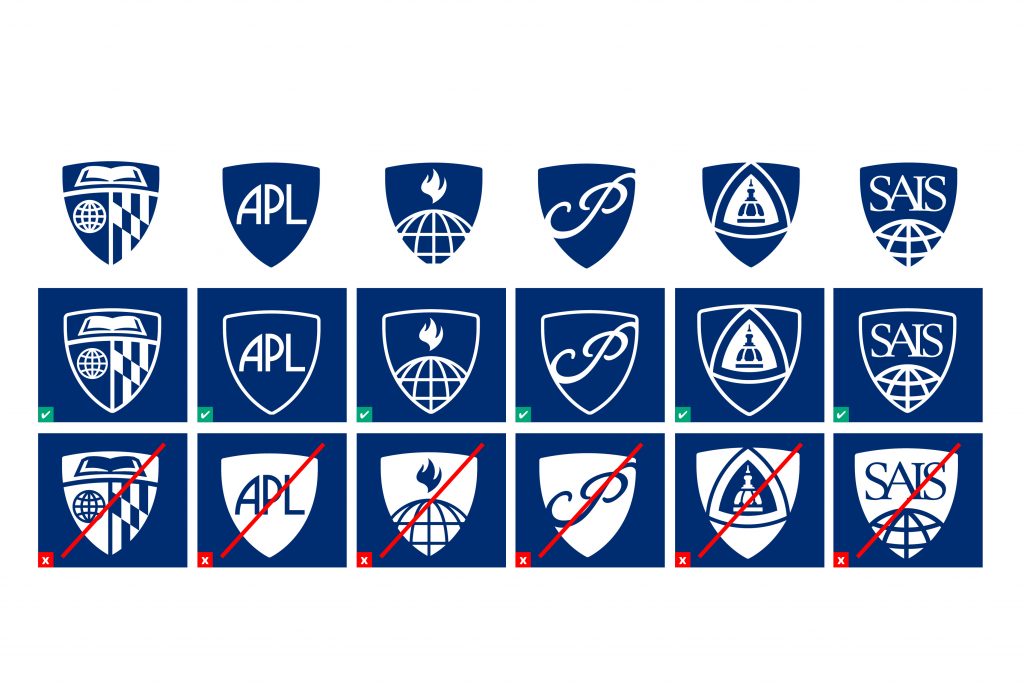
All division shields have both a blue and white version. They are not interchangeable.
Background
When choosing which logo color file to use, keep in mind that the logo must always be legible on your chosen background and the shield’s book pages and globe lines should always be a lighter color than the background. The examples on this page show incorrect and correct uses of the logo on various backgrounds.
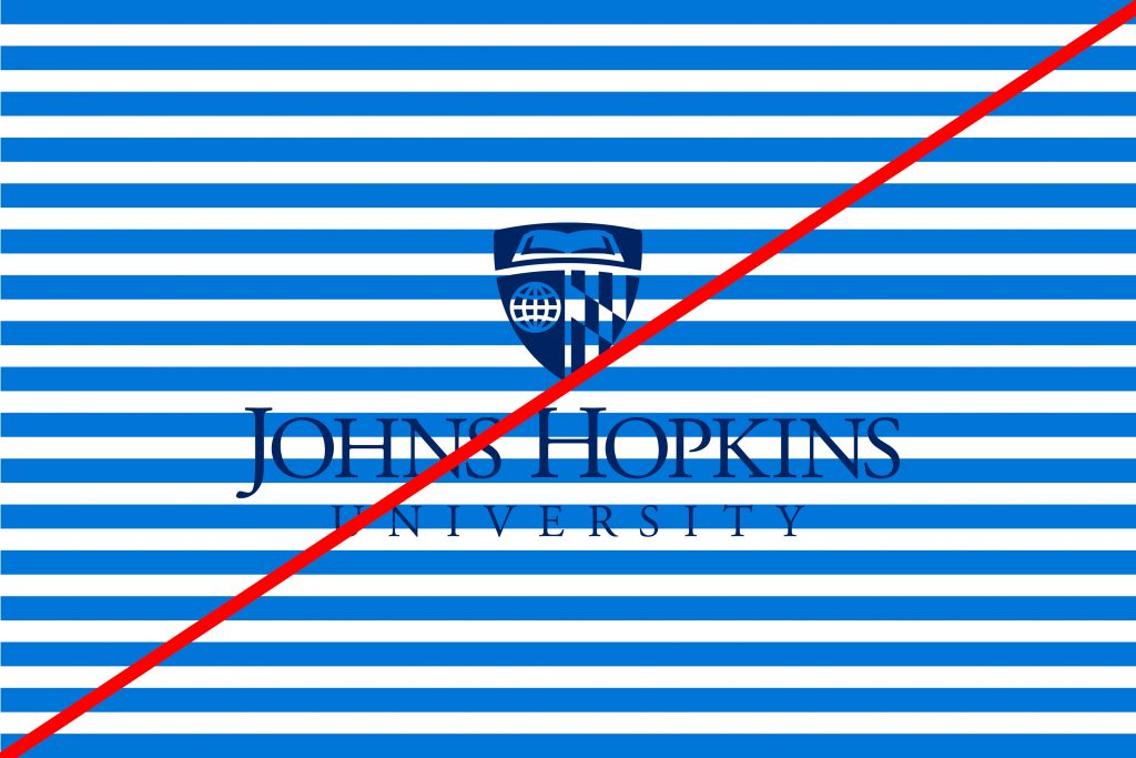
DON'T: Busy Background
Do not use the logo on complex patterns or textures.
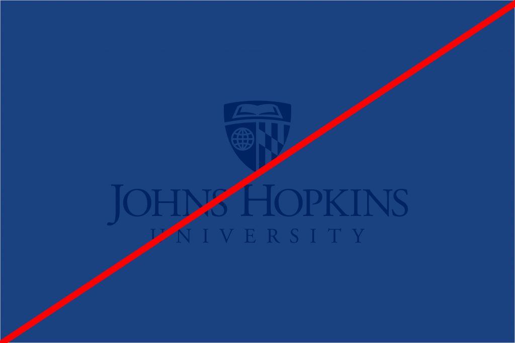
DON'T: Low Contrast
Do not use the logo on backgrounds that do not provide adequate contrast.
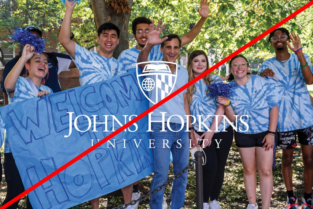
DON'T: Busy Photograph
Do not use the logo over busy photographs that reduce legibility.

DO: Simple Background
Do use the logo on solid backgrounds or simple patterns. When in doubt, include a gradient over the pattern or texture to ensure legibility.

DO: High Contrast
Do use the correct logo file depending on your background color so it can be easily seen. The white reserved logo should be used on dark backgrounds and the blue logo should be used on light backgrounds.

DO: Simple Photograph
Do choose images that include negative space for logo placement. Remember to comply with high-contrast rules.
Clear Space
Clear space is the area surrounding the logo that must be kept free of competing text or graphics. Leaving space around the logo ensures that it will stand out appropriately and that other words or graphics will not appear to be part of, or “locked up” with, the logo. The minimum required clear space is measured by the height of the capital H in Hopkins, but additional clear space should be added at the designer’s discretion when placing other graphics or text near the logo. No additional text or graphics may encroach on this space to avoid creating unapproved logo lock-ups or combinations.
The logo files available for download include the minimum clear space. Maintain clear space when placing the logo near edges, other type, or another design element.

Minimum Size
Our primary logos should be reproduced at a reasonable size to maintain legibility in all media.
- Do not size the vertical logo less than 1.25 inches or 160 pixels wide.
- Do not size the horizontal logo less than 1.625 inches or 190 pixels wide.
In smaller spaces, such as a favicon or an imprint area on a branded pen, consider using the stand-alone shield mark.
A note on embroidery
Specific minimum sizes for embroidery are required to maintain legibility. For branding on apparel with smaller imprint areas, consider screen-printing as a more scalable alternative.
- The vertical logo must be sized to at least 3 inches wide for embroidery.
- The horizontal logo must be sized to at least 3.5 inches wide for embroidery.
- The stand-alone shield mark can be considered for smaller embroidery areas, but must be sized to at least 1 inch wide.
Placement
It is best practice for one of our primary logos to appear on the initial view of all communications, including print, digital, and video so that it serves as an introduction to the brand. The logo should appear at the beginning AND end of videos unless the use case aligns with the exceptions below. Beyond this guideline, there is no preferred placement of the logo.
There are some exceptions:
- Magazines: Do not need to include the logo on the initial view if “Johns Hopkins” appears prominently in the title.
- Social Media: Videos produced exclusively for social media may omit the initial view if necessary to quickly engage the viewer. The logo must still be used at the end of the video. Static photo posts on social media do not need to include the logo if being shared by an official Johns Hopkins account, given the proximity to the account name and profile image.
- Video Series: The initial view logo may be omitted for individual videos in a series designed to be viewed in succession or distributed as part of a single package of videos or posted on a single webpage. The closing logo must still be used.