
Shield Mark
As recognizable symbols of the University and its divisions, shields may be used as design elements without the “Johns Hopkins University” wordmark.
The shields must remain intact and may not be altered in any way, but cropping is welcome. This mark follows the same color guidance as the primary logo but can also be used in a variety of opacities. Special care should be given to ensure the white reversed shield is used appropriately.
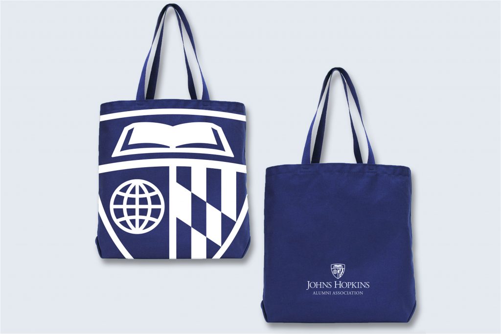
The shield mark works well by itself on merchandise due to its scalability. Whether it’s being used at a small size on a pen or large size on a tote bag, the shield maintains legibility and is a recognizable brand element. When possible, we recommend including the Johns Hopkins logo in a secondary imprint location.
The shield can be combined with typography to create limited-use artwork (e.g., a unique merchandise graphic). However, it may not be combined with department or division names in any way, to avoid creating an alternate logo.
The shield mark can be used as a background element in your designs to add depth and represent our brand. It can be used with or without the primary logo depending on your audience and use case. A 20% opacity is recommended for this method.
Shield Tag
The shield tag was introduced to meet the unique limitations of responsive design (e.g. website navigation resizing across platforms). When used, the full primary or division logo must also be present in the design, such as in a website footer.
Additionally, the shield tag can be used in designs that are multi-faceted, such as two-sided fliers, multi-page documents, or a series of light pole banners. Unlike the shield mark, the shield tag is a shorthand representation of the brand and should not be used without the primary logo in close proximity.
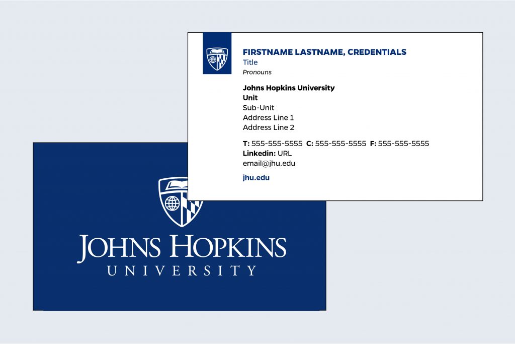
The shield tag is used to represent the brand on the front of business cards, noting that the Johns Hopkins University name is present in text on the front of the card and the primary logo is on the back of the card.
The shield tag can be used in website navigation as a “sticky logo” that remains consistent when scrolling. This is an instance where space is at a premium and the primary logo can be seen both in the footer and header of the site.

In this admitted student welcome mailer, the shield tag serves as an introduction to the Johns Hopkins brand, working in conjunction with the primary Johns Hopkins logo on the adjoining panel.
Shield Tag Usage
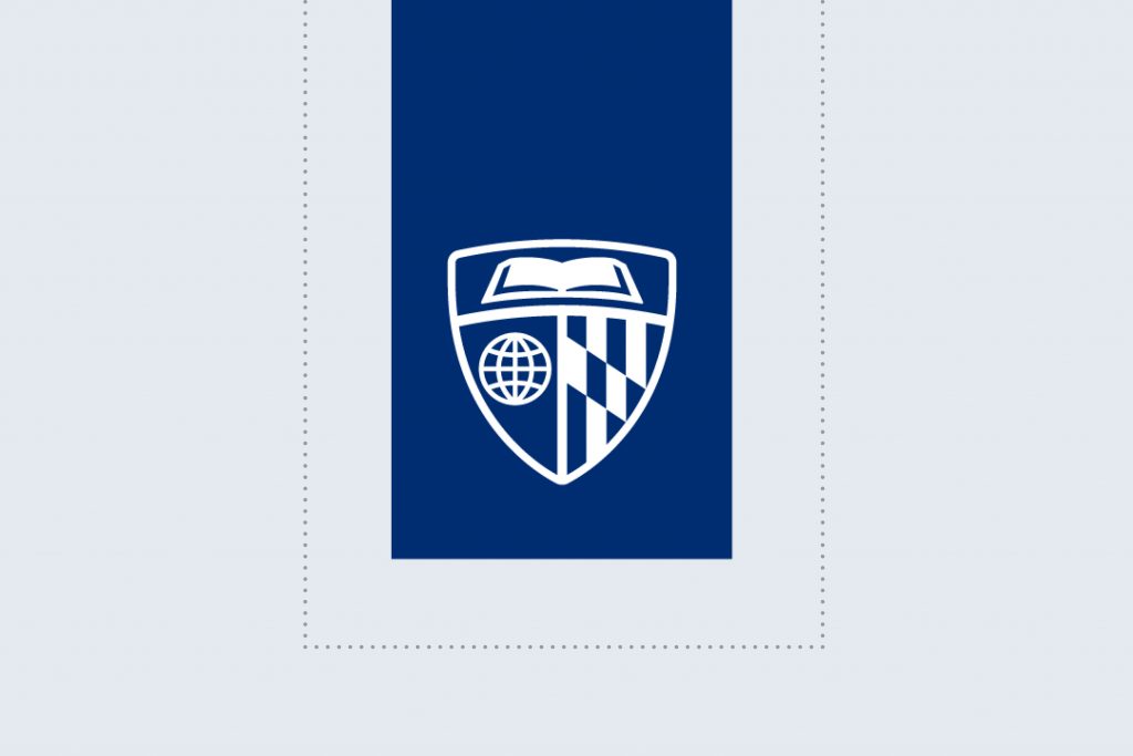
Spacing
Use only the provided shield tag files to maintain consistent proportions. The top bleed allowance should ideally be equal to the height of the shield. For clear space on the left, right, and bottom of the tag, use 25% of the width of the tag.

Bleed
In use, the top of the tag must bleed off the edge of the layout, but there should always be clear space on either side. The tag can be layered on top of photography, illustrations, or color fields. Because of the bleed requirement, the shield tag is often not ideal for use on merchandise.

Colors
Heritage Blue is the preferred shield tag color. As secondary options, Medium Blue and white can be used. Medium Blue and white should be used only on dark backgrounds.