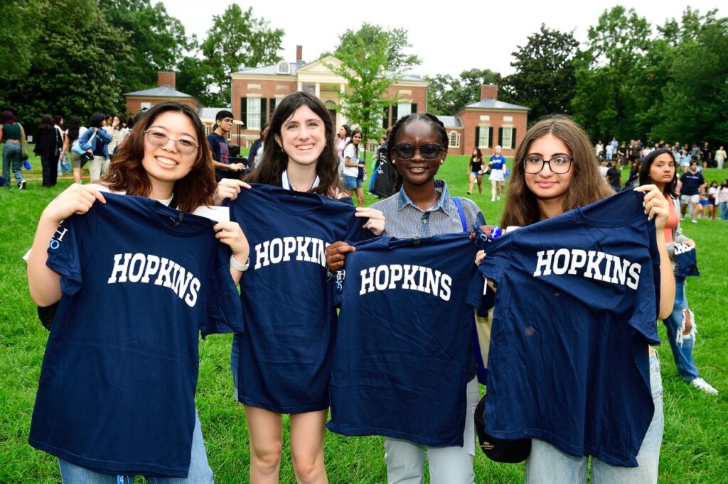
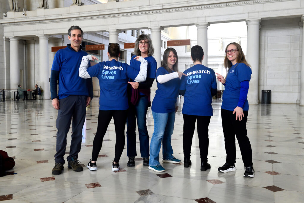
Merchandise Design Guidelines

If your unit is ordering custom merchandise outside of our ready-to-order options, follow these guidelines to ensure proper alignment with the Johns Hopkins University brand. All merchandise must be ordered from a CLC-licensed vendor.
On this page:
- Official Logos & Marks
- Plain Text
- Original Artwork
- Event, Campaign & Accent Graphics
- Additional Considerations
Official Logos & Marks
Whenever possible, include a Johns Hopkins University logo, lock-up, or mark on your merchandise, either as the primary artwork or in a secondary imprint location. Doing so signals to audiences that your unit, program, or event is affiliated with the university in an official capacity. Use of any JHU logos or marks must align with our clear space, minimum size, and background requirements.
Only one JHU logo or mark should be used at a time, following our co-branding guidelines. If multiple JHU units are sponsoring an event, the primary or division logo should be used and the units can be recognized in plain text.
Note: The white “reversed” logo being imprinted incorrectly is the problem we see the most often during licensing review. The blue logo/shield cannot be imprinted in white ink and vice versa. This applies to the primary and division logos and shields, as well as all lock-ups. Review our logo color guidance before proceeding.

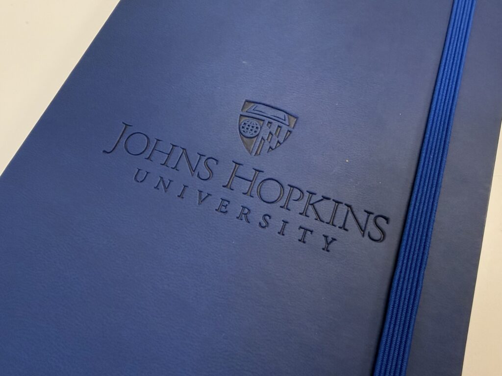
Primary JHU Logo
In many contexts, it’s most appropriate use the primary Johns Hopkins University logo on your merchandise, especially if it’s intended for external audiences or a wider JHU community beyond your unit.

Division Logos & Interdisciplinary Lock-Ups
Division logos and interdisciplinary lock-ups are permitted for use on merchandise, following the same guidance as the primary JHU logo.

Unit Lock-Ups
Unit lock-ups are permitted on merchandise and work best in formal applications, such as staff apparel. Not sure if your unit lock-up is appropriate for your merch use case? Check out our unit lock-up usage guidance.

Location Lock-Ups
Location lock-ups were developed primarily for use on permanent exterior signage, so use on merchandise is allowed, but limited. These lock-ups may be used on staff apparel, such as polos, and formal giveaways, such as notebooks and padfolios.

Shield Marks
As recognizable symbols of the university and divisions, shields marks may be used on merchandise. The shield must remain intact and may not be altered in any way, but cropping is welcome. This mark follows the same color guidance as the primary logo, but a background color may not be applied in isolation. The shield mark can be used as a design element in your original artwork if it is not locked to your unit or division name.
The shield tag should not be used on merchandise.

Spirit Marks
Our spirit marks, including the Split Block H, Blue Jay Marks, Mascot Marks, and Baby Jay, were created to evoke a sense of energy and Blue Jay pride. They’re ideally suited to represent Hopkins Athletics but are available for use enterprisewide to support brand affinity. Spirit marks may not be altered.
Note: Athletics logos, lock-ups, and marks are reserved for Hopkins Athletics use only, unless special permission is granted.
Plain Text

Plain text is unformatted text without any special characters, colors, or flourishes, like iconography.
In terms of the Johns Hopkins University brand, using plain text as merchandise artwork involves choosing one of our open-source brand fonts (Oswald, Work Sans, Roboto Slab, or Source Serif 4) and typing out your unit name, message, contact information, etc., to fit in the product’s specific imprint area.
Occasionally, bold or all caps can be used to indicate hierarchy, if necessary, but no other formatting should come into play to avoid appearing like a logo. It is permissible to include “Johns Hopkins University,” or any variation of the university name, in plain text as well.
Plain text is the preferred design solution for featuring a unit name when a unit lock-up does not fit the space or context of the giveaway.
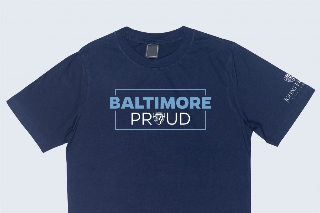
Original Artwork
Original artwork is permitted for use on merchandise, provided that the artwork aligns to our brand guidelines for fonts, colors, etc. This artwork can be a hand drawn or digital illustration, typographic design, or photo that represents your unit’s mission, event, or initiative. Follow the guidelines below when creating your original artwork. Plus, check out our Brand Showcase for additional examples!

JHU Brand Alignment
Leverage the Johns Hopkins University color palette and typography in your art. Custom or alternative fonts can be considered if called for in the design concept and properly licensed (e.g. hand lettering with an illustration or cross stitch font on a holiday shirt.)

Official Logo Use
Display the JHU logo, or a divisional/unit equivalent along with the original artwork, as space allows. Respect clear space requirements and prioritize secondary imprint locations, if available.

Unit Names & Acronyms
A shorthand or acronym for your unit’s name (e.g. JHU Sustainability) may be incorporated into original artwork. Use of the full unit name (e.g. Office of Climate & Sustainability) is not permitted, to avoid the appearance of an unofficial custom logo. If you wish to include the full unit name, please do so in plain text or with your unit lock-up.

Messaging
Consider using playful puns, related quotes, or unit taglines to convey your unit’s unique offerings and personality. You can also feature contact information, like your email, social media handle, or website address. This strategy is preferred over artwork that primarily highlights your unit name/acronym.

Illustrations
Hand drawn and digital illustrations should be reviewed to ensure they are a high enough resolution for print. Pay close attention to the number of colors used, as your merchandise may be limited in imprint colors.
Custom blue jay illustrations and iconography may be allowed with approval from University Communications.

Merchandise Use Only
Original merchandise artwork generally should not be repurposed for social media, websites, or other marketing materials. Doing so could give the appearance of a custom logo for your unit, which is not permitted. Consult [email protected] if you have a use case for your artwork in addition to merchandise.
Pro Tip: Established in 1876
Did you know that Johns Hopkins University was founded in 1876 and Johns Hopkins Hospital was founded in 1889? If you include a founding year in your merchandise design, it must be accompanied by the full name of the institution you’re representing, rather than “Hopkins” or “Johns Hopkins,” to avoid any confusion!
Event, Campaign & Accent Graphics
If you’re working with an approved established look and feel for an event, campaign, or sub-identity, the related graphics may be used on merchandise. It is best practice to also include an official JHU logo or shield when space allows.


Additional Considerations
Vendor-Ready Graphics
Select branded artwork is available for use on your merchandise orders. Download and share the EPS files with your vendor. This artwork is reserved for use on merchandise only.
Generative AI
Generative AI is not recommended for creating merchandise artwork, as it can often result in off-brand or low-quality designs. Please review our artificial intelligence guidelines for communicators for more information on this topic.
Imprint Methods
Our logos and lock-ups are intricate and feature fine lines and varying colorways, often making them difficult to reproduce depending on your imprint method. If you’re planning to use one of the following imprint methods, please review the guidance to ensure the proper logo file and size are used.

Embroidery
Review the logo embroidery style sheet to help align our embroidery standards across vendors and proactively address known challenges with our art. Please note, specific minimum sizes for embroidery are required:
- Vertical logo: at least 3 inches wide
- Horizontal logo: at least 3.5 inches wide
- Shield mark: at least 1 inch wide
Debossing & Embossing
For debossing (pictured—a sunken or recessed, colorless design), please use the blue version of the logo.
For embossing (a raised, colorless design), please use the white logo file.
The logo color itself won’t make a difference in your final design as these imprint methods do not traditionally use ink.

Glass Etching
The process of etching creates a colorless frosted imprint on glass. The imprint will appear white and therefore requires use of a white JHU logo for proper reproduction.

Laser Engraving – Wood
When laser engraving into wood (a layer of wood is removed by laser), the logo often appears burned in and darker than the wood product, itself. Therefore, the blue logo file should be used in these instances.
Laser Engraving – Metal
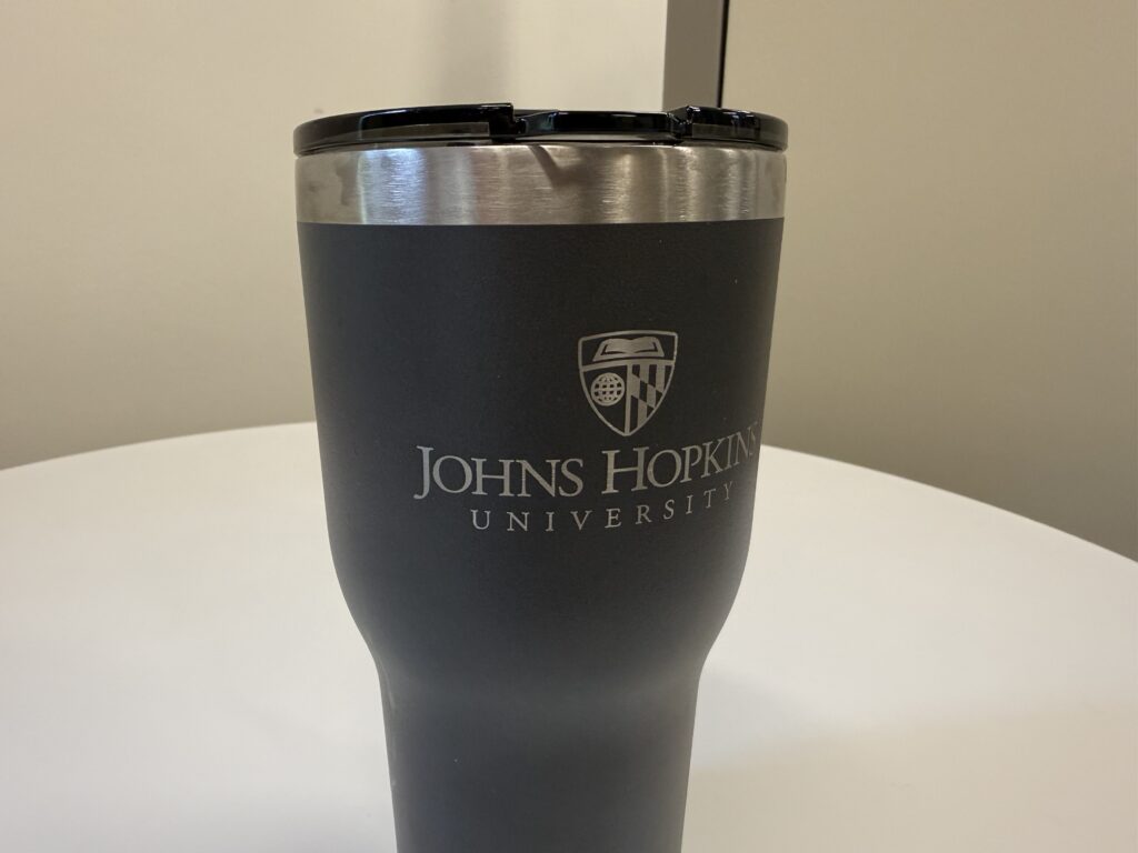
When laser engraving into metal (removing the top layer of metal to reveal the base metal underneath), the logo often appears lighter than the product color. Use the white logo file to achieve the correct imprint.
Note: If the product is a light metal, such as silver or gold, you may need to use the blue logo file for the correct imprint. A physical sample may be required to determine this.