June 25, 2026
Creating Branded Accessible Emails
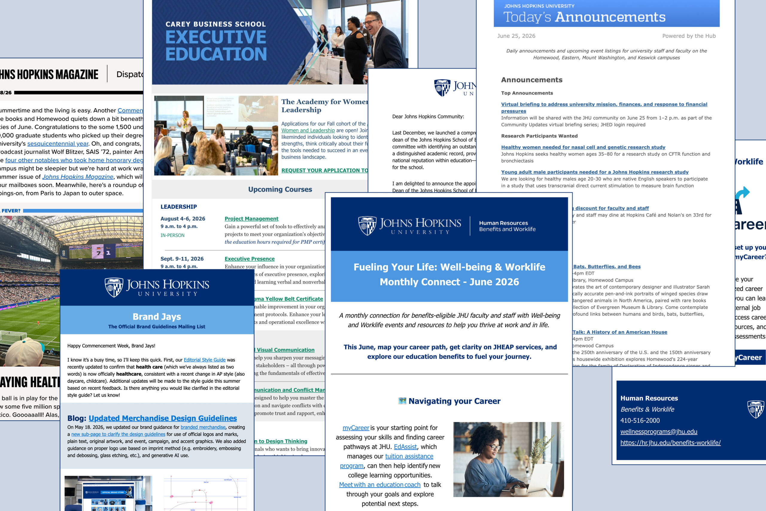
Email is one of our most popular and vital communications tools across the university, and it requires strategic planning, brand alignment, and consistency to ensure success. It is critical that all business, educational, and public-facing emails are brand-aligned and accessible.
Johns Hopkins University is committed to providing equal access to websites, web-based content, and other electronic and information technology. We follow the prevailing accessibility standard for digital content, currently the Web Content Accessibility Guidelines (WCAG) 2.1, Level AA. The Johns Hopkins IT team manages a Digital Accessibility website with resources like trainings, techniques, and FAQs.
We often hear from our stakeholders about challenges navigating these email accessibility requirements. That’s why we wrote this blog post, with support from the university’s digital accessibility coordinator! The following guidance is specific to official mass email communications sent on behalf of Johns Hopkins University and its divisions, departments, centers, institutes, etc. This can include business, educational, marketing, and informational emails.
Individual daily messages between faculty, staff, and students should still be accessible as a best practice and you can use the Microsoft Outlook accessibility checker to review before sending.
Email Platforms
Starting with platforms—if you’re looking to send visual-forward marketing and communications emails that are both branded and accessible, we recommend choosing a platform other than Microsoft Outlook. Email campaign management platforms like Emma, MailChimp, and Constant Contact, are built to accommodate brand and accessibility guidelines. Poppulo is ideal for branded internal communications campaigns. To find the best fit for your needs, review these platforms against your specific goals and audience requirements. Make sure to consult your Brand Ambassador or communications team to see if there is a preferred or existing platform for your department.
Accessible Design
Once you’ve identified a platform, you’ll have the tools to build branded accessible email campaigns, but this does require an understanding of the JHU brand guidelines and how they intersect with accessibility requirements. You can always save yourself some steps by using one of our branded templates. Let’s review some accessible design principles:
Color Contrast
Per WCAG, the minimum contrast ratios between your text/graphic colors and background colors are:
- 4.5:1 for normal text
- 3:1 for large text (at least 19px tall and bold, or 21px tall)
- 3:1 for graphics and UI components

Within the JHU brand color palette, we recommend the following accessible combinations for your email components. Remember to keep your styles consistent throughout your email to align with your users’ expectations for links, buttons, etc.
- Background: White
- Text: Heritage Blue, Sable, or Black
- Links: Medium Blue, underlined (Do not use color alone to convey meaning!)
- Make links descriptive: “Upcoming Events” instead of “Click here”
- Button Background: Heritage Blue or Homewood Green
- Button Text: White
If you’re using other colors from the JHU palette, make sure you review our color contrast grid or use a color contrast checker like the WAVE Color Contrast Tool.
Typography
Use an easily readable sans serif font for your email text. Within the JHU brand, our system default font, Tahoma, is preferred for this purpose. It is also best to keep your text left-aligned and follow these sizes:
- Headlines: At least 21px
- Body Copy: At least 12px, 16px preferred
Don’t forget to ensure your chosen text color has enough contrast against its background! See our color recommendations above.
Images
It’s not always necessary to include images or graphics in your email, but they can help to add context and draw a reader in. Overall, it’s important to not rely on images as your main content source in an email. When deciding which images are appropriate to include, consider these points:

- ALT Text: All informational images require alternative (ALT) text descriptions. Decorative images, on the other hand, should have null (blank) ALT text.
- ALT text should describe the image in such a way that if the image fails to load, or a user cannot see it, the user still has the same understanding of the image’s purpose in your email.
- JHU Logos and Lock-Ups: It’s always recommended that you include an official Johns Hopkins University logo in the email header and/or footer. Unit lock-ups can be used, but it is preferred to feature the unit name in text.
- ALT text example for the SAIS logo: “Johns Hopkins School of Advanced International Studies logo”
- Even if your logo or lock-up is used, it’s best practice to identify your department clearly in text, as well.
- Images with Embedded Text: Avoid including images that have text embedded, such as event flyers. Instead, include the content of the flyer natively in the email builder, using the defined styles for headings, body copy, links, etc. You can still include a hero image to draw a user in, but this should only serve to enhance your email—it should not be the primary focus.
- You may have heard that you can embed an event flyer in your email and simply repeat the text of the flyer below it in order to meet accessibility requirements. While this is technically accurate, it’s not best practice. Event promotion emails built out natively in the platform look significantly more professional and trustworthy than those with embedded flyers.
- Email Attachments: Remember that even your email attachment, whether it’s a JPEG, Word document, or PDF, needs to be accessible and on brand! If you’re attaching an image, like a JPEG, that includes text, that text will need to be repeated in the body of your email. PDFs, Word documents, and PowerPoint presentations have their own accessibility requirements to adhere to.
For more information on creating accessible emails, including how to write for accessibility, visit the Digital Accessibility website.