Division and Unit Identity
Overview
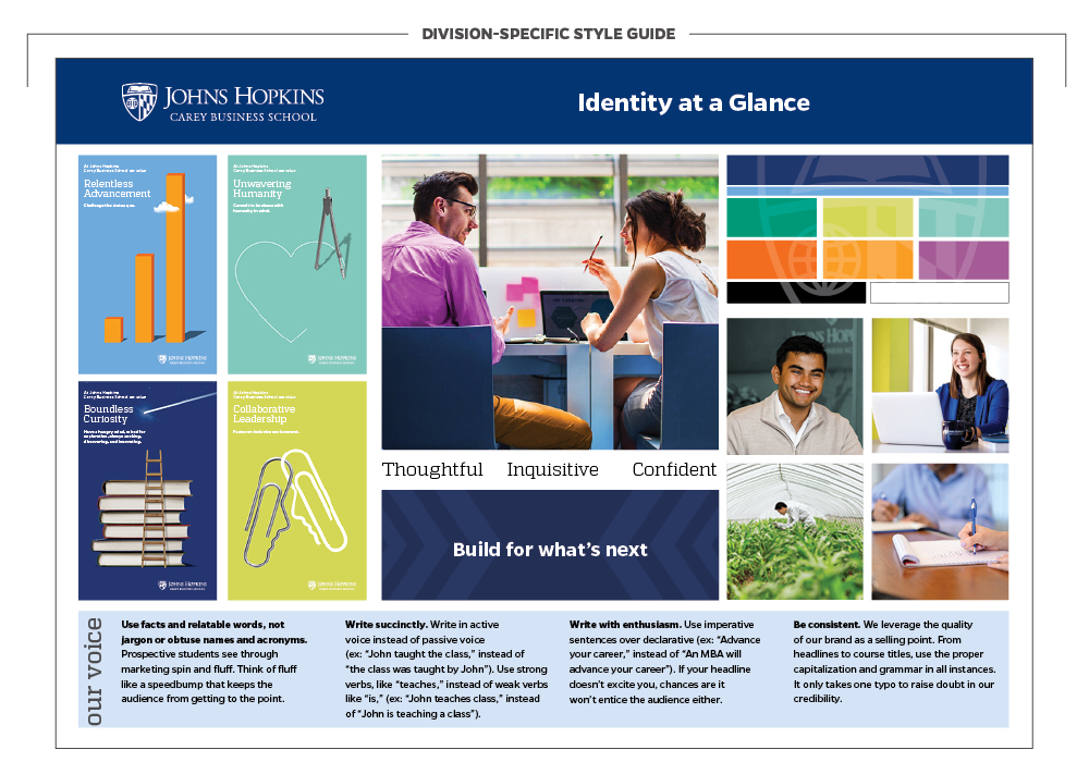
Our brand guidelines offer a variety of tools to foster flexibility and creativity in your communications. From accent colors to typography combinations, photography and key messages, the success of this adaptability relies on having a shared foundation to draw from.
Despite the range of Johns Hopkins endeavors and initiatives, the strongest, most recognizable brand we can project is that of our shared University. As such, our university logo architecture should remain consistent on all communications.
Stylistic choices can be made to tailor an aesthetic specific to your division or identity.
For divisions and units with a unique strategic need a supplemental identity guide or style sheet can be created. These resources must be created in partnership with University Communications.
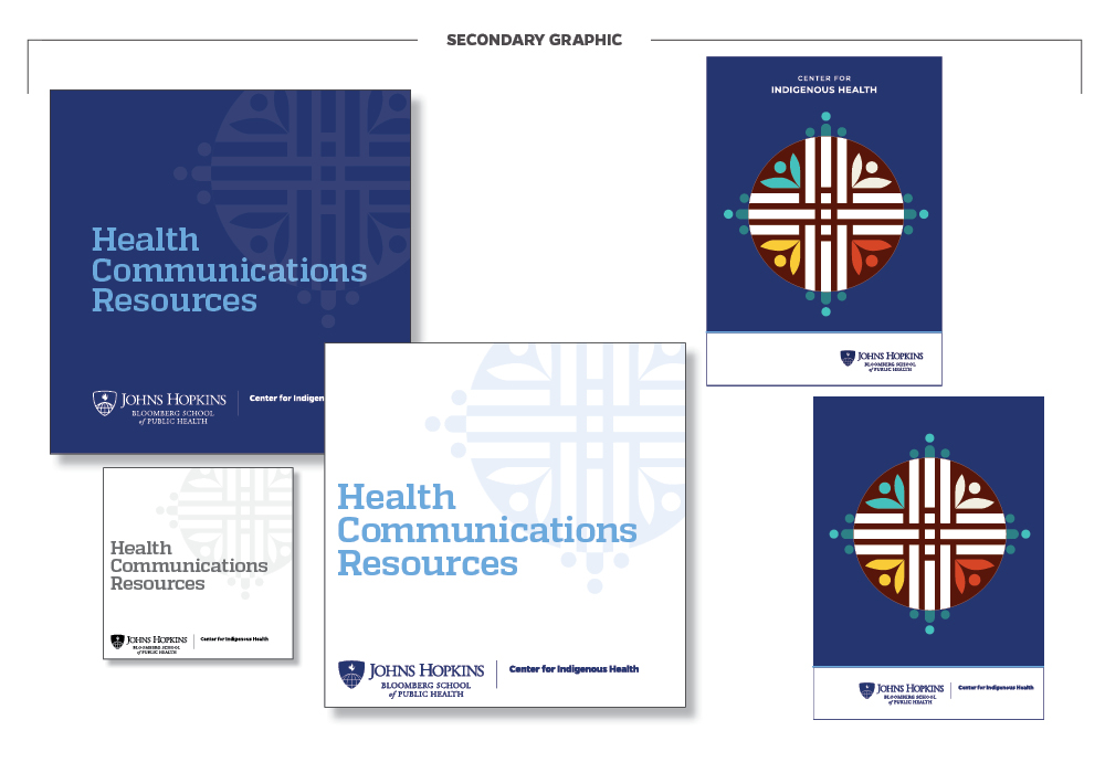
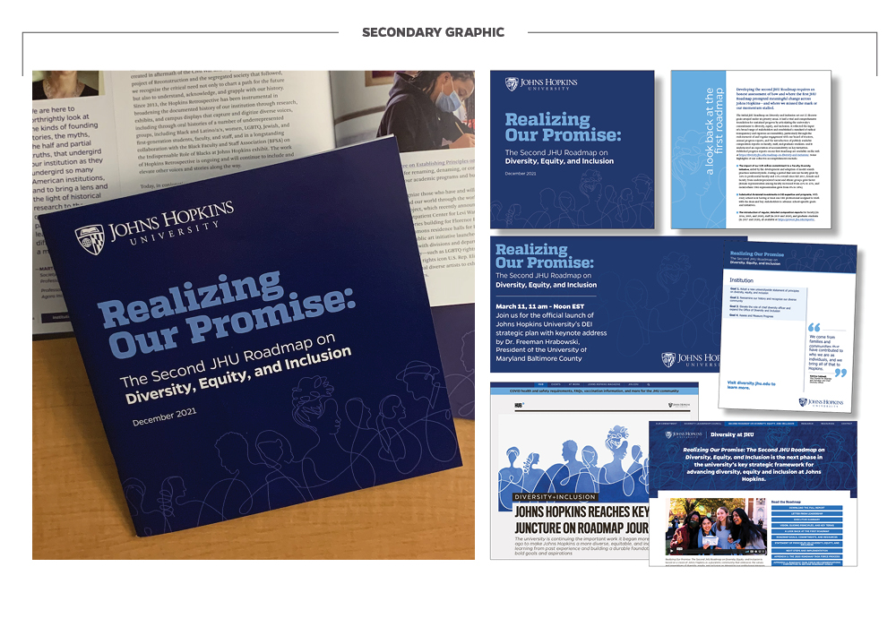
Secondary Graphics
In addition to our university-wide graphic elements, some divisions and units may draw on secondary graphics to tailor their communications more specifically to their audience. The difference between a secondary graphic and a logo is ultimately defined in the context of their use. Secondary graphics cannot be more prominent than the official university logo and should be a subtle complementing accent.