University Logo
Introduction
Developed in 2013, the Johns Hopkins University logo is rooted in tradition and serves as the primary signifier of the Johns Hopkins University brand identity. The logo’s iconography is based on the university’s official seal. This logo, or an official division or interdisciplinary logo, should be used on all communications materials.
It is essential that we do not dilute the prominence and recognition of the official Johns Hopkins University logos. None of the elements may be altered in any way, nor can individuals create their own logos or shields. Use only the digital artwork provided by University Communications on this website. Graphics cannot include or be framed in the shield shape from our logo architecture as not to introduce additional shields.
Our most recognizable logo is our standard Johns Hopkins University logo. When in doubt as to which logo to use on communications, our university logo can be used as it represents all corners of the University.
Logo Architecture
Anatomy
Shield – Our logo’s iconography is based on the university’s official seal. The open book represents knowledge and discovery, the globe signifies the university’s worldwide reach and responsibility, and the crest of Lord Baltimore is emblematic of the university’s commitment and connection to its community. These elements are framed in a shield that is a shared visual among all our schools and divisions.
Wordmark – The wordmark is a custom letterform and cannot be replicated by typing the letters.
Logo – The shield and wordmark are collectively known as the logo. The wordmark may never be used by itself without the shield. However, it is permitted to use the shield as artwork.
Divisions
There are 10 divisional logos that combine the university or division-specific shield with the Johns Hopkins name and the division name. In unique circumstances where divisions had distinct original graphics prior to our 2013 rebrand, those graphics were incorporated into their division-specific shield. Division logos all utilize the same shield shape and logo architecture to position ourselves as one shared university.
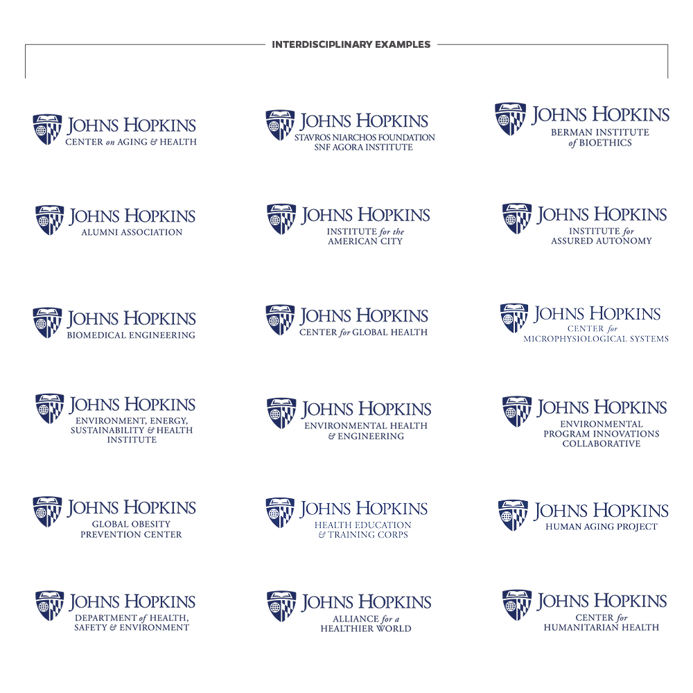
Interdisciplinary Collaborations
For centers, institutes, and programs spanning multiple divisions, an interdisciplinary logo can be created. It pairs the university shield and the Johns Hopkins name with the name of the interdisciplinary entity.
All requests for an interdisciplinary logo must be sent to University Communications, which will seek approval from the Provost’s Office and, if approved, create the logo. These logos cannot be created by another office. To request an interdisciplinary logo, please contact us.
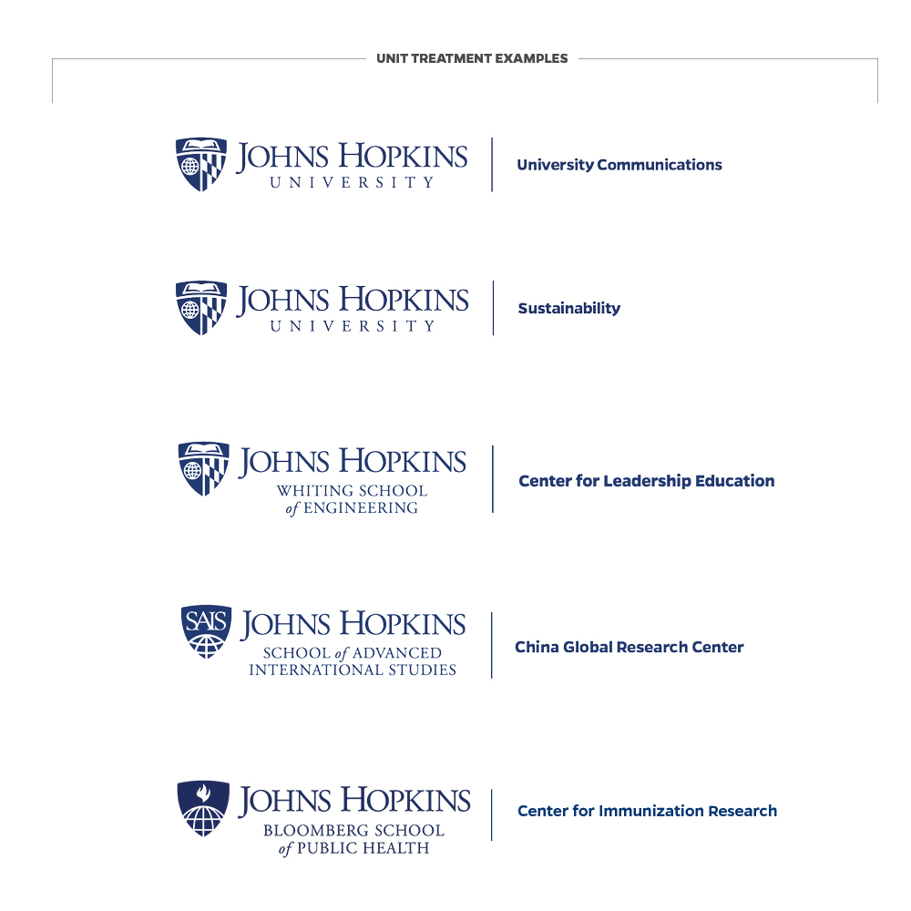
Unit Treatment Lockup
All divisional institutes and centers as well as academic and administration departments are part of our shared university brand. It benefits all our interests to present a clear and consistent association with each other and the institution through our unified logo architecture. As such, individual unit logos are not permitted.
When it is strategically necessary to include your unit name in close proximity to the university logo, all organizational units are required to use our official unit treatment lockup. For this use case, we pair a line to separate the logo from the unit name. The unit lockup is commonly used for internal team premiums, such as branded shirts for the Security or Events team of a specific division.
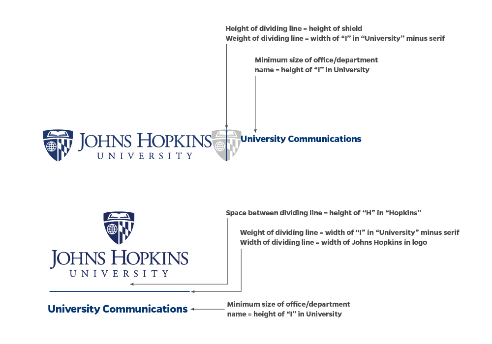
Uniformity
All unit lockups combine the Johns Hopkins University logo with unit names, according to set conventions. All fonts, colors, size and spatial relationships are based on a template and must not be altered.
- Do not create lockups outside the standard template or embellish a lockup in any way.
- Units may choose to include their full unit name or drop the prefix when a more concise form of identification is useful. For example “Department of Mechanical Engineering” can be shortened to “Mechanical Engineering.”
- Generally, it is not recommended to include “Office of” or “Department of” unless strategically necessary for clarification.
- Units should not include any references to “Johns Hopkins,” “JHU,” in their names to avoid duplication with the logo.
- Unit treatments cannot include acronyms, all caps, ampersands, special characters, contact information or taglines.
Where and when to use it
In many contexts, it is more appropriate to use our standard Johns Hopkins University logo in your design and present the name of your unit in prominent type. For example, on a website header or a report cover where space allows prominent inclusion of your department or center name in the header or title of the report, the unit treatment would likely become redundant and unnecessary.
Keep in mind that our brand guidelines offer a magnitude of tools to foster flexibility and creativity in your communications. From accent colors to typography combinations, photography and key messages, the success of this adaptability relies on having a shared foundation to draw from.
- Merch – When space allows, the formal unit lockup can be used on merchandise for internal merch and giveaways. More specifically, the unit logo should only be used in instances where the merch is being given to employees or students within your department or unit. For giveaways geared toward the wider JHU community (all students, employees outside of your department, etc.) it is best practice to use the primary Johns Hopkins University logo on your merch.
TIP: Ask yourself—as an employee from another unit, would you want to receive a giveaway with the University Communications lockup on it? What would you actually use or wear? It’s likely that the Johns Hopkins University logo will be most appreciated on your giveaways. - Standardized Templates – Don’t use lockups on university stationery, email signatures or campus signage. Use official stationery, signature and signage templates that account for unit names in standard fields to maximize legibility specific to those contexts.
Enterprise
The enterprise logo is reserved for instances when University Communications needs to represent the combined interests of Johns Hopkins University and Johns Hopkins Medicine. This logo is not available for download, as all instances of use must be approved by University Communications. For information about Johns Hopkins Medicine identity guidelines, please refer to brand.hopkinsmedicine.org.
- Name
- Heritage Blue
- PMS
- 288 C
- C
- 100
- M
- 80
- Y
- 6
- K
- 32
- R
- 0
- G
- 45
- B
- 114
- Hex
- #002D72
- Name
- White
- C
- 0
- M
- 0
- Y
- 0
- K
- 0
- R
- 255
- G
- 255
- B
- 255
- Hex
- #ffffff
- Name
- Sable
- PMS
- Black 4 C
- C
- 41
- M
- 57
- Y
- 72
- K
- 90
- R
- 49
- G
- 38
- B
- 29
- Hex
- #31261D
Logo Colors
Our logo colors are blue (PMS 288) and white. Both orientations are also available in one-color, black (PMS Black 4 C) for use in newsprint and other black-and-white applications. No other logo colors are acceptable.
Incorrect Reversed Logo
DO NOT REVERSE THE BLACK LOGO TO ACHIEVE THE WHITE LOGO. This is a common error, and doing so results in an incorrect reproduction. White logo files exist as part of the logo download packs. Since these are white logos, they need to be placed over a background color or image to be visible.
TIP: Here’s how to spot the difference: In the white logo, the shield itself should be an outline, rather than a color fill, and the book pages should be white.
Background Control
When choosing the logo color for your usage, keep in mind that the logo must always be legible on your chosen background and the shield’s book pages and globe lines should always be the lighter color compared to the background. The examples on this page show incorrect and correct uses of the logo on various backgrounds.
- Do not use the logo on complex patterns or textures.
- Do not use the logo on backgrounds that do not provide adequate contrast.
- Do not use the logo over busy photographs that reduce legibility.
Clear Space
Clear space is the area surrounding the logo that must be kept free of competing text or graphics. Leaving space around the logo ensures that it will stand out appropriately and that other words or graphics will not appear to be part of, or “locked up” with, the logo. The minimum clear space is measured by the height of the capital H in Hopkins. No additional text or graphics may encroach on this space.
The logo files available for download include the minimum clear space. Maintain the clear space when placing the logo near edges, other type, or another design element.
Minimum Size
The Johns Hopkins logo should be reproduced at a reasonable size to maintain legibility in all media.
- Do not size the vertical logo less than 1.25 inches wide or 160 pixels.
- Do not size the horizontal logo less than 1.625 inches wide or 190 pixels.
In smaller spaces such as an imprint area on a branded pen or use for a favicon, consider using the stand-alone shield.
Specific minimum sizes for embroidery are required to maintain legibility. For branding on apparel with smaller imprint areas, consider screen-printing as a more scalable alternative.
- The logo should not be embroidered on areas smaller than 4 x 4 inches.
- The stand-alone shield should not be embroidered on areas smaller than 2 x 2 inches.
Placement
It is best practice for the appropriate divisional, interdisciplinary, enterprise, or athletics logo to appear on the initial view of all communications, including print, digital, and video, so that it serves as an introduction to the brand. In video logo should appear at the front AND back of a video unless use case aligns to exceptions below. Beyond this guideline, there is no preferred placement of the logo. Design should dictate where the logo appears on the initial view.
THERE ARE SOME EXCEPTIONS:
- Magazines: Do not need to include the logo on initial view if Johns Hopkins appears prominently in the title.
- Social media: Videos produced exclusively for social media may omit the initial view if necessary to quickly engage the viewer. The logo must still be used at the end of the video.
- Video Series: The initial view logo may be omitted for individual videos in a series of videos designed to be viewed in succession or distributed as part of a single package of videos or posted on a single webpage. The closing logo must still be used.
Logo Bundle
A logo bundle refers to the zipped folder that includes all official file formats of an individual logo. Logo bundles must be created by University Communications or a divisional communications office using a standard template. This resource should be saved in a central location for your respective division or unit as it includes various file formats that will be needed for your communications and partnership with outside vendors. Logo bundles include vertical, horizontal, blue, black and white logo files in all industry standard file formats.
- For internal documents a .jpg file is generally sufficient.
- For internal documents where the logo is placed on a background color or image a .png file is generally best practice. When layering the logo file, it is essential to use the correct blue or white version of the file—see incorrect reversed logo.
- Most professional production will require a vector-based .eps file that offers the ability to scale infinitely without losing quality.